
THE COMPLETE STORY: Building Your First Website
Welcome, Future Web Developers!
Teacher: “Imagine you’re about to build something amazing – your very own website! But where do you start? Think of it like building a house. You need a plan, materials, and someone to make it beautiful. Let’s go on this journey together!”
PART 1: THE FOUNDATION – What Makes a Website?
The “Building a House” Story
Let’s take a journey and build a house together. Along the way, you’ll learn everything about HTML and CSS!
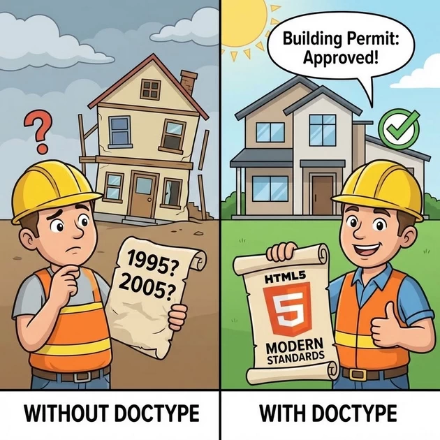
🏗️ Step 1: The Building Permit (<!DOCTYPE html>)
Teacher: “Before you build any house, what’s the first thing you need?”
Student: “Permission from the municipality!”
Teacher: “Exactly! You need a building permit that tells everyone: ‘This is a legitimate construction project following modern standards.'”
Without DOCTYPE:
Browser gets confused → "Is this from 1995? 2005? What rules apply?"
Your website looks different in Chrome vs Firefox 😱

With DOCTYPE:
Browser knows → "This is modern HTML5. I'll use today's standards."
Your website looks the SAME everywhere! 😊
Simple Analogy: It’s like telling a chef whether you want traditional cooking or modern fusion. Without that info, you might get raw food or burnt food!
The 2026 Secret: This one line is non-negotiable. Without it, browsers go into “confused mode” and your carefully designed CSS might break completely.
📋 Step 2: The Blueprint Cover (<html lang="en">)

Teacher: “Now you have your permit. Next, you need the blueprint cover that says: ‘This document is a building plan.’ That’s your <html> tag.”
<html lang="en"> <!-- This whole document is a website, in English -->
Why lang="en" Matters:
| Without Language | With Language |
|---|---|
| Screen readers don’t know which accent to use | Screen readers use correct pronunciation |
| Google doesn’t know who to show this to | Google knows: “Show this to English speakers” |
| Translation tools get confused | Browsers can offer to translate correctly |
Live Demo: “If I set lang="ta" for Tamil, screen readers will use Tamil pronunciation. Get this right for accessibility!”
🗄️ Step 3: The Utility Closet (<head>)
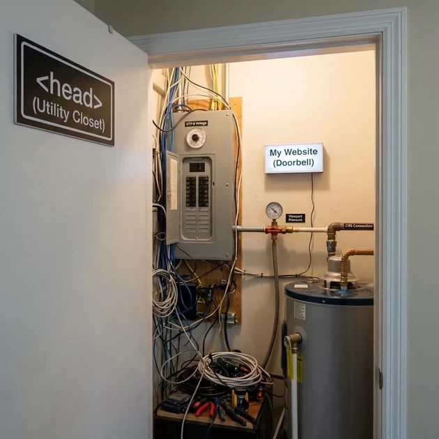
Teacher: “Every house has a room guests never see – the utility closet with the electrical panel, water heater, and internet router. That’s the <head> section.”
<head>
    <!-- All the important stuff visitors don't see directly -->
</head>
What’s in the Utility Closet:
| Element | What It Does | Analogy |
|---|---|---|
<meta charset="UTF-8"> | Tells browser which alphabet to use | Electrical voltage setting |
<meta name="viewport"> | Handles mobile screens | Water pressure regulator |
<title> | Sets browser tab name | House name on the doorbell |
<link rel="stylesheet"> | Connects CSS file | Connecting water heater to pipes |
🔤 Step 4: The Universal Translator (<meta charset="UTF-8">)

Teacher: “Imagine you’re writing a letter. Which alphabet will you use?”
| Script | Used For |
|---|---|
| Tamil | தமிழ் |
| Devanagari | हिन्दी |
| Latin | English |
| UTF-8 | EVERYTHING! |
The Horror Story (Without UTF-8):
Without UTF-8:    தமிழ் appears as தமிழ௠(gibberish!)
With UTF-8:       தமிழ் appears correctly as தமிழ் 😊
The “Universal Translator” Analogy:
Teacher: “UTF-8 is like having a universal translator that can handle every language on Earth – Tamil, Hindi, Chinese, Arabic, emojis 😊, special symbols ©. Without it, your page only understands basic English.”
2026 Secret: This meta tag should be the first line after <head>. Browsers read top to bottom. If they encounter Tamil text before knowing it’s UTF-8, they might misinterpret it permanently.
📱 Step 5: The Shape-Shifting Magic (<meta name="viewport">)
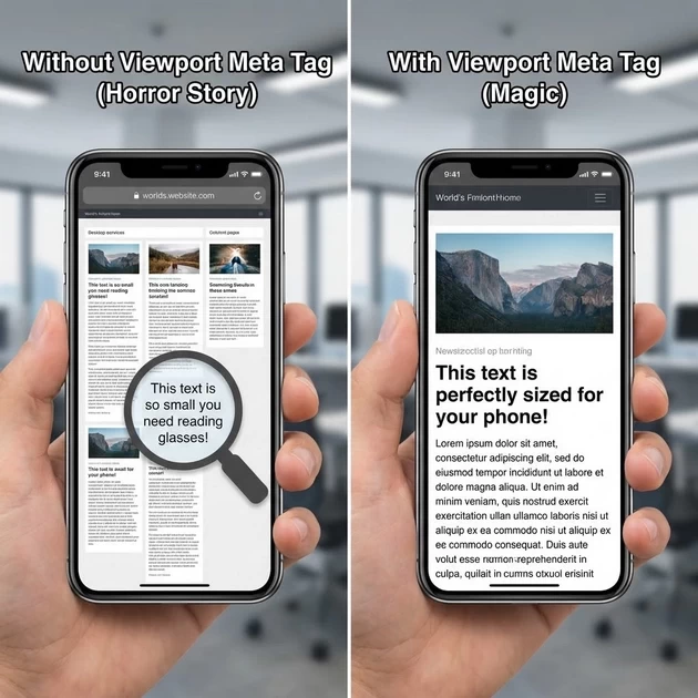
Teacher: “Imagine a building that automatically reshapes itself depending on who enters:”
| Visitor | Building Shape |
|---|---|
| Person on foot | Narrow entrance, easy access (mobile) |
| Person in car | Wider driveway (tablet) |
| Person in truck | Extra wide loading bay (desktop) |
That’s what the viewport meta tag does for websites!
<meta name="viewport" content="width=device-width, initial-scale=1.0">Breaking It Down:
| Part | What It Does | Analogy |
|---|---|---|
width=device-width | “Match the device’s screen width” | Building senses visitor’s size |
initial-scale=1.0 | “Start at 100% zoom” | Don’t automatically zoom out |
The Horror Story (Without Viewport):
Desktop site: [ Beautiful 3-column layout ]
Mobile phone: [ Tiny text you need to pinch and zoom ]
                ┌─────────────────────┐
                │  This text is so    │
                │  small you need     │
                │  reading glasses!   │
                └─────────────────────┘
The Magic (With Viewport):
Desktop site: [ Beautiful 3-column layout ]
Mobile phone: [ Single column, readable text ]
                ┌─────────────────────┐
                │  This text is       │
                │  perfectly sized    │
                │  for your phone!    │
                └─────────────────────┘
2026 Secret: Without this line, mobile browsers pretend they have a 980px wide screen (old computer size) and shrink everything. Your beautiful 16px text becomes 8px and unreadable. This one line FIXES that.
PART 2: THE COMPLETE HTML STRUCTURE – Your House Blueprint
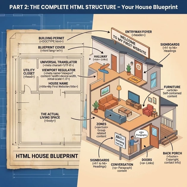
The Basic Template – Your Starting Point
<!DOCTYPE html>              <!-- Building permit -->
<html lang="en">             <!-- Blueprint cover -->
<head>                       <!-- Utility closet -->
    <meta charset="UTF-8">   <!-- Universal translator -->
    <meta name="viewport" content="width=device-width, initial-scale=1.0">
    <title>My First Website</title>  <!-- House name -->
</head>
<body>                       <!-- The actual living space -->
    <!-- All visible content goes here -->
</body>
</html>
The “Room by Room” Guide
Teacher: “Now let’s build the actual house – room by room!”
| HTML Tag | Room in a House | What It Does |
|---|---|---|
<header> | The entryway/foyer | Welcome area with your name/logo |
<nav> | The hallway connecting rooms | Links to different pages |
<main> | The living room | Main content of the page |
<section> | Different zones in living room | Group related content |
<article> | Individual furniture pieces | Self-contained content |
<footer> | The back porch/exit area | Copyright, contact info |
<h1> to <h6> | Signboards of different importance | Headings (1 is biggest) |
<p> | Spoken conversation | Paragraphs of text |
<a> | Doors to other rooms | Links to other pages |
Let’s Build Our First House!
<!DOCTYPE html> <html lang="en"> <head> <meta charset="UTF-8"> <meta name="viewport" content="width=device-width, initial-scale=1.0"> <title>Blooming Institute</title> </head> <body> <!-- ENTRYWAY --> <header> <h1>🌐 Blooming Institute of Technology</h1> <p>Learn. Grow. Succeed.</p> </header> <!-- HALLWAY (Navigation) --> <nav> <ul> <li><a href="#">Home</a></li> <li><a href="#">Courses</a></li> <li><a href="#">About</a></li> <li><a href="#">Contact</a></li> </ul> </nav> <!-- LIVING ROOM (Main Content) --> <main> <!-- First zone --> <section> <h2>Our Courses</h2> <ul> <li>Digital Marketing</li> <li>Python Programming</li> <li>Web Design</li> <li>Tally Prime</li> </ul> </section> <!-- Second zone --> <section> <h2>Why Choose Us?</h2> <p>ISO Certified Institute with 5000+ successful students.</p> <p>📍 Trichy | 📞 +91 87782 39513</p> </section> </main> <!-- BACK PORCH (Footer) --> <footer> <p>© 2026 Blooming Institute. All rights reserved.</p> </footer> </body> </html>
Student Observation: “It looks boring – just black text on white!”
Teacher: “Exactly! That’s HTML alone. It’s like a house with just walls – functional, but not beautiful. Now we need CSS to make it a HOME!”
🌟 Information Gain: Semantic HTML (2026 Secret)
Teacher: “In 2026, accessibility is law. Screen readers (for blind users) read your HTML structure.”
| Wrong Way | Right Way | Why |
|---|---|---|
<div class="header"> | <header> | Screen reader says “beginning of header” |
<div class="nav"> | <nav> | Screen reader says “navigation” |
<div class="footer"> | <footer> | Screen reader says “footer” |
The Secret: “Google penalizes sites with poor HTML structure. Use the right tags, rank higher. It’s like using the right ingredients for the right dish!”
🎨 PART 3: CSS – The Interior Design Magic
What is CSS? The “Interior Designer”
Teacher: “HTML built the house. CSS is the interior design team that makes it beautiful.”
| HTML (Construction) | CSS (Interior Design) |
|---|---|
| Built the walls | Paints the walls |
| Installed windows | Hangs curtains |
| Created rooms | Arranges furniture |
| Added doors | Decorates doors |
| Built the structure | Makes it feel like HOME |
The “Before & After” Transformation
🏗️ BEFORE CSS (Just HTML):
┌─────────────────────────────────────┐
│                                     │
│   HOME                              │
│                                     │
│   About                             │
│   This is my house.                 │
│                                     │
│   Contact                           │
│   Call me.                          │
│                                     │
└─────────────────────────────────────┘

✨ AFTER CSS (Styled):
┌─────────────────────────────────────┐
│  🏠 WELCOME HOME 🏠                  │
│  ┌───────────────────────────────┐  │
│  │ ABOUT                          │  │
│  │ This beautiful house was...    │  │
│  └───────────────────────────────┘  │
│  ┌───────────────────────────────┐  │
│  │ CONTACT 📞                     │  │
│  │ Call us today!                 │  │
│  └───────────────────────────────┘  │
└─────────────────────────────────────┘
Teacher: “Would you rather live in the first house or the second? Same structure, completely different feel!”
CSS Syntax – The “Decoration Instructions”
selector {
    property: value;
}
| CSS Part | Design Analogy |
|---|---|
selector | “Which room?” (Living room? Kitchen?) |
property | “What to change?” (Wall color? Flooring?) |
value | “How to change it?” (Blue? Marble?) |
Example:
living-room {        /* Selector: which room */
    wall-color: blue;   /* Property: value */
    floor-type: hardwood;
    lighting: warm;
}
Real CSS:
h1 {
    color: blue;        /* Make all main headings blue */
    font-size: 24px;    /* Make them 24 pixels tall */
    text-align: center; /* Center them on the page */
}
CSS Selectors – Finding the Right “Room”
🏠 Type Selector: element
h1 { }  /* All main headings */
p { }   /* All paragraphs */
div { } /* All divisions */
Analogy: “Paint ALL the bedrooms the same color.”
bedroom {
    wall-color: light-blue;
}
/* Every bedroom in the house gets light blue walls */
🏷️ Class Selector: .class
.highlight { }   /* Any element with class="highlight" */
.special { }     /* Any element with class="special" */
.course-card { } /* Any element with class="course-card" */
Analogy: “Paint ONLY the rooms marked with a ‘special’ sign.”
<div class="special">This room gets special treatment</div>
<div>This room stays normal</div>
.special {
    wall-color: gold;
}
/* Only rooms with class="special" get gold walls */
🌟 Information Gain: Classes are REUSABLE. You can mark multiple rooms as ‘special’ and they ALL get gold walls!
🔑 ID Selector: #id
#header { }         /* The ONE element with id="header" */
#main-content { }   /* The ONE element with id="main-content" */
#footer { }         /* The ONE element with id="footer" */
Analogy: “Paint the SPECIFIC room with this exact name – and only this one.”
<div id="master-bedroom">The master bedroom</div>
#master-bedroom {
    wall-color: royal-blue;
}
/* ONLY this exact room gets royal blue */
🌟 Information Gain: IDs must be UNIQUE. Like house numbers – you can’t have two houses with the same number.
The “Street Address” Hierarchy:
| Selector | Analogy | Usage |
|---|---|---|
* | “Every house on every street” | Universal (rarely used) |
div | “All houses” | Broad |
.card | “All houses with a ‘card’ sign” | Reusable group |
#header | “123 Main Street” | One specific house |
CSS Properties – Your Design Toolkit
🎨 Color – The “Paint”
color: blue;           /* Text color */
background-color: red; /* Background color */
Analogy: “Paint the walls (background) and furniture (text).”
The Color Systems:
| System | Example | Best For |
|---|---|---|
| Named colors | red, blue, green | Quick, limited |
| HEX | #ff0000 (red) | Web standard |
| RGB | rgb(255,0,0) | Digital screens |
| HSL | hsl(0,100%,50%) | Human-friendly |
🌟 2026 Secret: Use hsl() for easy color schemes. hsl(0,100%,50%) is red. Change hue to 120 for green. It’s like a color wheel you can dial!
✍️ Font-Family – The “Typography”
font-family: Arial, Helvetica, sans-serif;
Analogy: “Choose the handwriting style for your text.”
The Font Stack:
| Font | Fallback | Category |
|---|---|---|
Arial | First choice (if installed) | Sans-serif |
Helvetica | Second choice | Sans-serif |
sans-serif | Last resort (any sans-serif) | Generic |
Analogy: “First try the premium paint (Arial). If not available, try the standard paint (Helvetica). Finally, use whatever white paint you have (sans-serif).”
🌟 Information Gain: Always end with a generic family – serif, sans-serif, monospace. This ensures SOMETHING displays.
📏 Font-Size – The “Text Size”
font-size: 16px;    /* Fixed size */
font-size: 1.2em;   /* Relative to parent */
font-size: 1.2rem;  /* Relative to root */
| Unit | Analogy | Best For |
|---|---|---|
px | “Exactly 1 inch letters” | Precise control |
em | “Twice as big as parent” | Scaling within sections |
rem | “Twice as big as root” | Consistent across site |
% | “50% of normal size” | Proportional scaling |
🌟 2026 Secret: Use rem for accessibility. Users can set their browser’s default text size. rem respects that. px doesn’t. Be kind to users with vision challenges!
📦 The Box Model – Understanding the “Furniture”
Teacher: “Every element on a webpage is a box. CSS lets you control four layers of every box:”
┌─────────────────────────────────┐
│                                 │
│   MARGIN (outside space)        │
│   ┌─────────────────────────┐   │
│   │                         │   │
│   │   BORDER (the wall)      │   │
│   │   ┌─────────────────┐   │   │
│   │   │                 │   │   │
│   │   │   PADDING       │   │   │
│   │   │   (inside space)│   │   │
│   │   │   ┌─────────┐   │   │   │
│   │   │   │         │   │   │   │
│   │   │   │ CONTENT │   │   │   │
│   │   │   │ (stuff) │   │   │   │
│   │   │   │         │   │   │   │
│   │   │   └─────────┘   │   │   │
│   │   │                 │   │   │
│   │   └─────────────────┘   │   │
│   │                         │   │
│   └─────────────────────────┘   │
│                                 │
└─────────────────────────────────┘
🚶 Margin – The “Personal Space”
margin: 20px; /* Space OUTSIDE the box */
Analogy: “Margin is the personal space around an element. Just like you don’t want someone standing too close, elements need space.”
Without margin:
[Text][Text][Text] ← Too close, uncomfortable 😖

With margin:
[Text]   [Text]   [Text] ← Comfortable distance 😊
The Clock Direction Rule:
margin: 10px 15px 20px 25px;
        ↑    ↑    ↑    ↑
        TOP  RIGHT BOTTOM LEFT
      (12:00) (3:00) (6:00) (9:00)
🛋️ Padding – The “Room Inside”
padding: 20px; /* Space INSIDE the box */
Analogy: “Padding is the space between your walls and your furniture.”
Without padding:
┌─────────────────────┐
│[FURNITURE]          │ ← Text touches the edge
│                     │   (feels cramped) 😖
└─────────────────────┘

With padding:
┌─────────────────────┐
│                     │
│   [FURNITURE]       │ ← Space around content
│                     │   (feels comfortable) 😊
└─────────────────────┘
Margin vs. Padding – The Clear Difference
| Margin | Padding |
|---|---|
| Space BETWEEN elements | Space INSIDE an element |
| Personal space between people | Space between you and your clothes |
| Distance between houses | Distance between wall and furniture |
Visual Memory Trick:
┌─────────────────────┐
│  ┌───────────────┐  │
│  │               │  │ ← Padding (inside)
│  │   CONTENT     │  │
│  │               │  │
│  └───────────────┘  │
│                     │ ← Margin (outside)
└─────────────────────┘
Analogy: “If you’re wearing a jacket:
The jacket itself = the border
Space between you and jacket = padding
Space between you and another person = margin”
🧱 Border – The “Property Line”
border: 2px solid black;
border: 5px dashed red;
border: 1px dotted blue;
| Border Property | What It Does | Analogy |
|---|---|---|
border-width | Thickness | 2-foot wall vs 6-foot wall |
border-style | Pattern | Solid wall, picket fence, chain link |
border-color | Color | Red brick, white picket, black iron |
The Complete Border:
border: 2px solid #3498db;
/*        ↑     ↑       ↑
      width  style   color */
⭕ Border-Radius – The “Curved Corners”
border-radius: 10px;    /* All corners rounded */
border-radius: 50%;     /* Perfect circle */
Analogy: “Imagine a coffee table with sharp corners. Now imagine sanding those corners to make them round and safe.”
Without border-radius:
┌─────────────────────┐
│                     │ ← Sharp corners (hurts if you bump) 😖
└─────────────────────┘

With border-radius:
╭─────────────────────╮
│                     │ ← Rounded corners (soft, modern) 😊
╰─────────────────────╯

With border-radius: 50%;
      ╭─────╮
      │     │ ← Perfect circle (great for profile pictures!)
      ╰─────╯
🌟 Information Gain: Use border-radius: 50% on a square to make a perfect circle. Great for profile pictures!
↔️ Display – The “Behavior Mode”
display: block;       /* Takes full width, starts new line */
display: inline;      /* Takes only needed width, flows with text */
display: inline-block;/* Best of both */
display: flex;        /* Modern, powerful layout */
display: none;        /* Hides completely */
| Display | Analogy | Example |
|---|---|---|
block | Sofa – Takes full width, can’t put anything beside it | <div>, <h1>, <p> |
inline | Painting on wall – Flows with text, width based on content | <span>, <a> |
inline-block | Bookshelf – Can be beside other items, fixed dimensions | Buttons, cards |
flex | Modular shelving – Items arrange themselves perfectly | Modern layouts |
Visual Demonstration:
block:
┌─────────────────────┐
│ Block element       │ ← Takes whole row
└─────────────────────┘
┌─────────────────────┐
│ Next block starts   │ ← New line
└─────────────────────┘

inline:
Text before <span>inline</span> text after
           ↑     ↑     ↑
           All on same line, only as wide as needed

inline-block:
[Button 1] [Button 2] [Button 3]
All on same line but each has fixed width
🧲 Flexbox – The “Magnetic Furniture Arranger”
Teacher: “Imagine furniture that MAGNETICALLY arranges itself perfectly, no matter how many pieces you have. That’s Flexbox!”
.container {
    display: flex;           /* Activate the magic! */
}
↔️ Justify-Content – “Horizontal Arrangement”
justify-content: flex-start;    /* All at start (left) */
justify-content: center;        /* All centered */
justify-content: flex-end;      /* All at end (right) */
justify-content: space-between; /* Space between items */
justify-content: space-around;  /* Space around each item */
justify-content: space-evenly;  /* Perfectly equal space */
justify-content: flex-start;
[Item 1] [Item 2] [Item 3]                 ← All left

justify-content: center;
         [Item 1] [Item 2] [Item 3]        ← All center

justify-content: space-between;
[Item 1]                 [Item 2] [Item 3]  ← Space between

justify-content: space-around;
  [Item 1]    [Item 2]    [Item 3]         ← Space around
Analogy: “Different ways to arrange photos on a wall:
flex-start: Start from left cornercenter: Center the whole groupspace-between: Equal gaps between photosspace-around: Equal gaps around each photo”
↕️ Align-Items – “Vertical Arrangement”
align-items: flex-start;   /* Align to top */
align-items: center;       /* Center vertically */
align-items: flex-end;     /* Align to bottom */
align-items: stretch;      /* Fill height (default) */
Analogy: “Hanging pictures on a wall at different heights:
flex-start: All at eye level (top)center: All centered verticallyflex-end: All near the floorstretch: Make all pictures same height”
🔄 Flex-Direction – “Row vs Column”
flex-direction: row;           /* Left to right (default) */
flex-direction: row-reverse;   /* Right to left */
flex-direction: column;        /* Top to bottom */
flex-direction: column-reverse; /* Bottom to top */
Analogy:
row: Reading a book left to rightcolumn: Reading a list top to bottom
📱 Responsive Design – The “Shape-Shifter”
Teacher: “Remember our building that changes shape based on who enters? That’s responsive design with media queries.”
@media (max-width: 768px) {
    /* Styles for mobile devices */
    .container {
        flex-direction: column;
    }
}
Desktop (1200px+):
┌─────────────────────────────────────┐
│  [Card 1]  [Card 2]  [Card 3]      │ ← 3 columns
└─────────────────────────────────────┘

Tablet (768px):
┌─────────────────────────────────────┐
│  [Card 1]  [Card 2]                 │ ← 2 columns
│  [Card 3]                           │
└─────────────────────────────────────┘

Mobile (480px):
┌─────────────────────────────────────┐
│  [Card 1]                           │ ← 1 column
│  [Card 2]                           │
│  [Card 3]                           │
└─────────────────────────────────────┘
🌟 2026 Secret: Design for mobile FIRST. Write styles for mobile, then use min-width to add complexity for larger screens. This is faster and more efficient!
LIVE DEMO: Building Our Complete Template
Step 1: HTML Structure (index.html)
<!DOCTYPE html> <html lang="en"> <head> <meta charset="UTF-8"> <meta name="viewport" content="width=device-width, initial-scale=1.0"> <title>Blooming Institute - Web Design Demo</title> <link rel="stylesheet" href="style.css"> </head> <body> <header> <h1>🌐 Blooming Institute of Technology</h1> <p>Learn. Grow. Succeed.</p> </header> <nav> <ul> <li><a href="#">Home</a></li> <li><a href="#">Courses</a></li> <li><a href="#">About</a></li> <li><a href="#">Contact</a></li> </ul> </nav> <main> <section class="courses"> <h2>Our Courses</h2> <ul> <li>Digital Marketing</li> <li>Python Programming</li> <li>Web Design</li> <li>Tally Prime</li> </ul> </section> <section class="about"> <h2>Why Choose Us?</h2> <p>ISO Certified Institute with 5000+ successful students. Practical training with job-ready skills.</p> <p class="highlight">📍 Trichy | 📞 +91 87782 39513</p> </section> </main> <footer> <p>© 2026 Blooming Institute. All rights reserved.</p> </footer> </body> </html>
Step 2: CSS Styling (style.css)
/* Global styles - the whole house */
* {
    margin: 0;
    padding: 0;
    box-sizing: border-box;
}

body {
    font-family: 'Segoe UI', Tahoma, Geneva, Verdana, sans-serif;
    line-height: 1.6;
    background: linear-gradient(135deg, #667eea 0%, #764ba2 100%);
    min-height: 100vh;
    padding: 20px;
}

/* Header - the entryway */
header {
    background-color: rgba(255, 255, 255, 0.95);
    padding: 30px;
    text-align: center;
    border-radius: 10px 10px 0 0;
    box-shadow: 0 2px 10px rgba(0,0,0,0.1);
}

header h1 {
    color: #333;
    font-size: 2.5em;
    margin-bottom: 10px;
}

header p {
    color: #666;
    font-size: 1.2em;
}

/* Navigation - the hallway */
nav {
    background-color: #333;
    padding: 15px;
}

nav ul {
    list-style: none;
    display: flex;
    justify-content: center;
    gap: 30px;
}

nav a {
    color: white;
    text-decoration: none;
    font-weight: bold;
    padding: 5px 10px;
    transition: all 0.3s ease;
}

nav a:hover {
    background-color: #555;
    border-radius: 5px;
}

/* Main content - the living room */
main {
    display: flex;
    gap: 20px;
    padding: 20px;
    background-color: rgba(255, 255, 255, 0.95);
}

section {
    flex: 1;
    padding: 20px;
    background-color: white;
    border-radius: 8px;
    box-shadow: 0 2px 5px rgba(0,0,0,0.1);
}

section h2 {
    color: #333;
    margin-bottom: 15px;
    border-bottom: 2px solid #667eea;
    padding-bottom: 10px;
}

section ul {
    list-style-position: inside;
    color: #666;
}

section li {
    margin: 10px 0;
}

.about .highlight {
    background-color: #667eea;
    color: white;
    padding: 10px;
    border-radius: 5px;
    text-align: center;
    margin-top: 15px;
}

/* Footer - the back porch */
footer {
    background-color: #333;
    color: white;
    text-align: center;
    padding: 15px;
    border-radius: 0 0 10px 10px;
    font-size: 0.9em;
}

/* Responsive - mobile styles */
@media (max-width: 768px) {
    main {
        flex-direction: column;
    }

    nav ul {
        flex-direction: column;
        align-items: center;
        gap: 10px;
    }

    header h1 {
        font-size: 1.8em;
    }
}
QUICK REFERENCE CARD
┌─────────────────────────────────────────────────────┐
│  HTML & CSS CHEAT SHEET                               │
├─────────────────────────────────────────────────────┤
│                                                       │
│  🏗️ HTML STRUCTURE:                                   │
│  <!DOCTYPE html>      ← Building permit              │
│  <html lang="en">     ← Blueprint cover              │
│  <head>...</head>     ← Utility closet               │
│  <body>               ← Living space                 │
│    <header>...</header> ← Entryway                   │
│    <nav>...</nav>     ← Hallway                      │
│    <main>...</main>   ← Living room                  │
│    <footer>...</footer> ← Back porch                 │
│                                                       │
│  🎨 CSS SELECTORS:                                    │
│  element → All bedrooms                              │
│  .class  → All rooms marked 'special'                │
│  #id     → This exact room (123 Main St)            │
│                                                       │
│  📦 BOX MODEL:                                        │
│  margin  = Space BETWEEN elements                    │
│  border  = The wall around element                   │
│  padding = Space INSIDE element                      │
│  content = The actual text/image                     │
│                                                       │
│  ↔️ DISPLAY:                                          │
│  block   = Sofa (takes full width)                   │
│  inline  = Painting (flows with text)                │
│  flex    = Magnetic furniture arranger               │
│                                                       │
│  🧲 FLEXBOX:                                          │
│  justify-content = Horizontal arrangement           │
│  align-items     = Vertical arrangement             │
│  flex-direction  = Row vs column                    │
│                                                       │
│  📱 RESPONSIVE:                                       │
│  @media  = Shape-shifting building                  │
│                                                       │
│  🔧 2026 SECRETS:                                     │
│  • Semantic HTML = better SEO                        │
│  • Flexbox = easy layouts                            │
│  • CSS variables = easy updates                      │
│  • Inspector = debug superpower                      │
│  • AI = your coding assistant                        │
│                                                       │
└─────────────────────────────────────────────────
Exercise 1.1: All Headings Styling
Create a page showing all 6 headings with different colors and sizes.
<!DOCTYPE html>
<html>
<head>
    <title>Headings Demo</title>
    <style>
        h1 { color: #e74c3c; font-size: 32px; }
        h2 { color: #3498db; font-size: 28px; }
        h3 { color: #2ecc71; font-size: 24px; }
        h4 { color: #f39c12; font-size: 20px; }
        h5 { color: #9b59b6; font-size: 18px; }
        h6 { color: #1abc9c; font-size: 16px; }
    </style>
</head>
<body>
    <h1>Heading 1 - Main Title (Red)</h1>
    <h2>Heading 2 - Section Title (Blue)</h2>
    <h3>Heading 3 - Subsection (Green)</h3>
    <h4>Heading 4 - Topic (Orange)</h4>
    <h5>Heading 5 - Subtopic (Purple)</h5>
    <h6>Heading 6 - Small Text (Teal)</h6>
</body>
</html>
Student Task: Change colors to your favorite colors and adjust sizes.
Exercise 1.2: Paragraph Styling
Create paragraphs with different font styles, sizes, and alignments.
<!DOCTYPE html>
<html>
<head>
    <title>Paragraph Styling</title>
    <style>
        .para1 {
            font-family: Arial;
            font-size: 18px;
            color: #333;
            text-align: left;
        }
        .para2 {
            font-family: 'Times New Roman';
            font-size: 20px;
            color: #e74c3c;
            text-align: center;
            font-style: italic;
        }
        .para3 {
            font-family: 'Courier New';
            font-size: 16px;
            color: #27ae60;
            text-align: right;
            font-weight: bold;
        }
    </style>
</head>
<body>
    <p class="para1">This is left-aligned Arial text. Lorem ipsum dolor sit amet.</p>
    <p class="para2">This is centered italic Times New Roman text.</p>
    <p class="para3">This is right-aligned bold Courier text.</p>
</body>
</html>
Student Task: Create 3 more paragraphs with different font families.
Exercise 1.3: Text Decoration
Create text with underline, overline, line-through, and combinations.
<!DOCTYPE html>
<html>
<head>
    <title>Text Decoration</title>
    <style>
        .underline { text-decoration: underline; color: blue; }
        .overline { text-decoration: overline; color: green; }
        .line-through { text-decoration: line-through; color: red; }
        .combination {
            text-decoration: underline overline;
            color: purple;
            font-size: 24px;
        }
    </style>
</head>
<body>
    <h2 class="underline">This text has underline</h2>
    <h2 class="overline">This text has overline</h2>
    <h2 class="line-through">This text has line-through</h2>
    <h2 class="combination">This has both underline and overline</h2>
</body>
</html>
Student Task: Create a combination of underline and line-through.
Exercise 1.4: Text Transform
Create text in uppercase, lowercase, and capitalize.
<!DOCTYPE html>
<html>
<head>
    <title>Text Transform</title>
    <style>
        .uppercase { text-transform: uppercase; }
        .lowercase { text-transform: lowercase; }
        .capitalize { text-transform: capitalize; }
        .normal { text-transform: none; }
    </style>
</head>
<body>
    <h3 class="uppercase">this will be uppercase</h3>
    <h3 class="lowercase">THIS WILL BE lowercase</h3>
    <h3 class="capitalize">this will capitalize each word</h3>
    <h3 class="normal">This remains normal</h3>
</body>
</html>
Student Task: Write a sentence and apply all four transforms.
Exercise 1.5: Letter Spacing & Word Spacing
Create text with different spacing.
<!DOCTYPE html>
<html>
<head>
    <title>Letter and Word Spacing</title>
    <style>
        .normal { letter-spacing: normal; word-spacing: normal; }
        .wide-letters { letter-spacing: 5px; }
        .narrow-letters { letter-spacing: -1px; }
        .wide-words { word-spacing: 20px; }
        .both-spacing {
            letter-spacing: 3px;
            word-spacing: 15px;
            font-size: 20px;
        }
    </style>
</head>
<body>
    <p class="normal">Normal spacing - regular text</p>
    <p class="wide-letters">Wide letters - spaced out</p>
    <p class="narrow-letters">Narrow letters - squeezed together</p>
    <p class="wide-words">Words have big gaps between them</p>
    <p class="both-spacing">Both letter and word spacing changed</p>
</body>
</html>
Student Task: Create a paragraph with 10px letter spacing and 30px word spacing.
📦 SET 2: DIV & SPAN (5 Exercises)
Exercise 2.1: Simple Div Box
Create colored boxes using div.
<!DOCTYPE html>
<html>
<head>
    <title>Div Boxes</title>
    <style>
        .red-box {
            background-color: #e74c3c;
            color: white;
            padding: 20px;
            margin: 10px;
            border-radius: 10px;
            width: 200px;
        }
        .blue-box {
            background-color: #3498db;
            color: white;
            padding: 20px;
            margin: 10px;
            border-radius: 10px;
            width: 200px;
        }
        .green-box {
            background-color: #2ecc71;
            color: white;
            padding: 20px;
            margin: 10px;
            border-radius: 10px;
            width: 200px;
        }
    </style>
</head>
<body>
    <div class="red-box">Red Box - Content here</div>
    <div class="blue-box">Blue Box - Content here</div>
    <div class="green-box">Green Box - Content here</div>
</body>
</html>
Student Task: Create 5 boxes with different colors and add borders.
Exercise 2.2: Div with Border Styles
Create divs with different border styles.
<!DOCTYPE html>
<html>
<head>
    <title>Border Styles</title>
    <style>
        .solid {
            border: 5px solid #3498db;
            padding: 20px;
            margin: 10px;
        }
        .dashed {
            border: 5px dashed #e74c3c;
            padding: 20px;
            margin: 10px;
        }
        .dotted {
            border: 5px dotted #2ecc71;
            padding: 20px;
            margin: 10px;
        }
        .double {
            border: 5px double #f39c12;
            padding: 20px;
            margin: 10px;
        }
        .rounded {
            border: 5px solid #9b59b6;
            border-radius: 20px;
            padding: 20px;
            margin: 10px;
        }
    </style>
</head>
<body>
    <div class="solid">Solid Border</div>
    <div class="dashed">Dashed Border</div>
    <div class="dotted">Dotted Border</div>
    <div class="double">Double Border</div>
    <div class="rounded">Rounded Corners</div>
</body>
</html>
Student Task: Create a div with groove border style and different colored borders on each side.
Exercise 2.3: Span Highlighting
Use span to highlight parts of text.
<!DOCTYPE html>
<html>
<head>
    <title>Span Highlighting</title>
    <style>
        .highlight {
            background-color: yellow;
            font-weight: bold;
            padding: 2px;
        }
        .important {
            background-color: #e74c3c;
            color: white;
            padding: 2px 5px;
            border-radius: 5px;
        }
        .code {
            font-family: 'Courier New';
            background-color: #2c3e50;
            color: #f1c40f;
            padding: 2px 5px;
            border-radius: 3px;
        }
    </style>
</head>
<body>
    <p>
        This is a normal sentence with
        <span class="highlight">highlighted text</span>
        in the middle. Here is
        <span class="important">very important text</span>
        that stands out. You can also write
        <span class="code">code-like text</span>
        using span.
    </p>
</body>
</html>
Student Task: Create a paragraph with at least 5 different span styles.
Exercise 2.4: Div Layout – Cards
Create card-style divs for a course listing.
<!DOCTYPE html>
<html>
<head>
    <title>Course Cards</title>
    <style>
        .card-container {
            display: flex;
            gap: 20px;
            flex-wrap: wrap;
        }
        .card {
            width: 250px;
            border: 1px solid #ddd;
            border-radius: 8px;
            overflow: hidden;
            box-shadow: 0 4px 8px rgba(0,0,0,0.1);
        }
        .card-image {
            height: 150px;
            background: linear-gradient(135deg, #667eea 0%, #764ba2 100%);
        }
        .card-content {
            padding: 15px;
        }
        .card-title {
            font-size: 20px;
            font-weight: bold;
            margin-bottom: 10px;
            color: #333;
        }
        .card-description {
            color: #666;
            margin-bottom: 15px;
        }
        .card-price {
            font-weight: bold;
            color: #e74c3c;
        }
        .card-button {
            background-color: #3498db;
            color: white;
            border: none;
            padding: 8px 16px;
            border-radius: 4px;
            cursor: pointer;
            margin-top: 10px;
        }
    </style>
</head>
<body>
    <div class="card-container">
        <div class="card">
            <div class="card-image"></div>
            <div class="card-content">
                <div class="card-title">Digital Marketing</div>
                <div class="card-description">Learn SEO, Social Media & Ads</div>
                <div class="card-price">₹15,000</div>
                <button class="card-button">Enroll Now</button>
            </div>
        </div>
        <div class="card">
            <div class="card-image"></div>
            <div class="card-content">
                <div class="card-title">Python Programming</div>
                <div class="card-description">From basics to advanced</div>
                <div class="card-price">₹18,000</div>
                <button class="card-button">Enroll Now</button>
            </div>
        </div>
        <div class="card">
            <div class="card-image"></div>
            <div class="card-content">
                <div class="card-title">Web Design</div>
                <div class="card-description">HTML, CSS, JavaScript</div>
                <div class="card-price">₹12,000</div>
                <button class="card-button">Enroll Now</button>
            </div>
        </div>
    </div>
</body>
</html>
Student Task: Add 3 more cards for Tally, MS Office, and Data Recovery.
Exercise 2.5: Div Layout – Profile Card
Create a profile card with avatar, name, and social links.
<!DOCTYPE html>
<html>
<head>
    <title>Profile Card</title>
    <style>
        .profile-card {
            width: 300px;
            background: white;
            border-radius: 15px;
            box-shadow: 0 10px 30px rgba(0,0,0,0.2);
            overflow: hidden;
            text-align: center;
            margin: 20px;
        }
        .profile-header {
            background: linear-gradient(135deg, #667eea 0%, #764ba2 100%);
            height: 100px;
        }
        .profile-image {
            width: 100px;
            height: 100px;
            border-radius: 50%;
            border: 4px solid white;
            margin-top: -50px;
            margin-bottom: 10px;
        }
        .profile-name {
            font-size: 24px;
            font-weight: bold;
            color: #333;
            margin: 10px 0 5px;
        }
        .profile-title {
            color: #666;
            margin-bottom: 15px;
        }
        .profile-info {
            display: flex;
            justify-content: space-around;
            padding: 20px 0;
            border-top: 1px solid #eee;
            border-bottom: 1px solid #eee;
        }
        .info-item {
            text-align: center;
        }
        .info-value {
            font-size: 20px;
            font-weight: bold;
            color: #333;
        }
        .info-label {
            color: #666;
            font-size: 14px;
        }
        .profile-bio {
            padding: 20px;
            color: #777;
            line-height: 1.6;
        }
        .profile-social {
            padding: 0 20px 20px;
        }
        .social-link {
            display: inline-block;
            width: 40px;
            height: 40px;
            line-height: 40px;
            text-align: center;
            background: #f0f2f5;
            border-radius: 50%;
            margin: 0 5px;
            color: #333;
            text-decoration: none;
            font-weight: bold;
        }
        .social-link:hover {
            background: #667eea;
            color: white;
        }
    </style>
</head>
<body>
    <div class="profile-card">
        <div class="profile-header"></div>
        <img src="https://via.placeholder.com/100" alt="Avatar" class="profile-image">
        <div class="profile-name">John Doe</div>
        <div class="profile-title">Web Developer & Trainer</div>

        <div class="profile-info">
            <div class="info-item">
                <div class="info-value">50+</div>
                <div class="info-label">Projects</div>
            </div>
            <div class="info-item">
                <div class="info-value">500+</div>
                <div class="info-label">Students</div>
            </div>
            <div class="info-item">
                <div class="info-value">5+</div>
                <div class="info-label">Years</div>
            </div>
        </div>

        <div class="profile-bio">
            Passionate web developer with expertise in HTML, CSS, JavaScript, and Python. Love teaching beginners.
        </div>

        <div class="profile-social">
            <a href="#" class="social-link">FB</a>
            <a href="#" class="social-link">TW</a>
            <a href="#" class="social-link">IG</a>
            <a href="#" class="social-link">LI</a>
        </div>
    </div>
</body>
</html>
Student Task: Create your own profile card with your photo (use placeholder) and details.
📋 SET 3: LISTS (5 Exercises)
Exercise 3.1: Unordered List Styling
Create styled unordered lists with custom bullets.
<!DOCTYPE html>
<html>
<head>
    <title>Unordered Lists</title>
    <style>
        .circle-list {
            list-style-type: circle;
            color: #3498db;
        }
        .square-list {
            list-style-type: square;
            color: #e74c3c;
        }
        .none-list {
            list-style-type: none;
            color: #2ecc71;
        }
        .emoji-list {
            list-style-type: none;
            padding: 0;
        }
        .emoji-list li::before {
            content: "✅ ";
            color: green;
        }
    </style>
</head>
<body>
    <h3>Circle bullets:</h3>
    <ul class="circle-list">
        <li>HTML</li>
        <li>CSS</li>
        <li>JavaScript</li>
    </ul>

    <h3>Square bullets:</h3>
    <ul class="square-list">
        <li>Python</li>
        <li>Java</li>
        <li>C++</li>
    </ul>

    <h3>No bullets:</h3>
    <ul class="none-list">
        <li>Digital Marketing</li>
        <li>SEO</li>
        <li>Social Media</li>
    </ul>

    <h3>Emoji bullets:</h3>
    <ul class="emoji-list">
        <li>Completed HTML</li>
        <li>Completed CSS</li>
        <li>Completed JavaScript</li>
    </ul>
</body>
</html>
Student Task: Create a list with star emoji bullets (⭐).
Exercise 3.2: Ordered List Styling
Create styled ordered lists with different numbering.
<!DOCTYPE html>
<html>
<head>
    <title>Ordered Lists</title>
    <style>
        .roman-list {
            list-style-type: upper-roman;
            color: #9b59b6;
        }
        .alpha-list {
            list-style-type: lower-alpha;
            color: #3498db;
        }
        .nested-list {
            list-style-type: decimal;
        }
        .nested-list ul {
            list-style-type: lower-roman;
            color: #e74c3c;
        }
    </style>
</head>
<body>
    <h3>Roman numerals:</h3>
    <ol class="roman-list">
        <li>Introduction</li>
        <li>Main Content</li>
        <li>Conclusion</li>
    </ol>

    <h3>Alphabetical:</h3>
    <ol class="alpha-list">
        <li>First step</li>
        <li>Second step</li>
        <li>Third step</li>
    </ol>

    <h3>Nested list:</h3>
    <ol class="nested-list">
        <li>Chapter 1
            <ul>
                <li>Section 1.1</li>
                <li>Section 1.2</li>
            </ul>
        </li>
        <li>Chapter 2
            <ul>
                <li>Section 2.1</li>
                <li>Section 2.2</li>
            </ul>
        </li>
    </ol>
</body>
</html>
Student Task: Create an ordered list with custom counter starting from 10.
Exercise 3.3: Horizontal Navigation Menu
Create a horizontal navigation menu using lists.
<!DOCTYPE html>
<html>
<head>
    <title>Navigation Menu</title>
    <style>
        .nav-menu {
            list-style-type: none;
            margin: 0;
            padding: 0;
            overflow: hidden;
            background-color: #333;
            border-radius: 5px;
        }
        .nav-menu li {
            float: left;
        }
        .nav-menu li a {
            display: block;
            color: white;
            text-align: center;
            padding: 14px 16px;
            text-decoration: none;
            font-weight: bold;
        }
        .nav-menu li a:hover {
            background-color: #4CAF50;
        }
        .nav-menu .active {
            background-color: #4CAF50;
        }
    </style>
</head>
<body>
    <ul class="nav-menu">
        <li><a class="active" href="#home">Home</a></li>
        <li><a href="#courses">Courses</a></li>
        <li><a href="#about">About</a></li>
        <li><a href="#contact">Contact</a></li>
        <li><a href="#blog">Blog</a></li>
    </ul>

    <div style="padding:20px; margin-top:20px;">
        <h3>Horizontal Navigation Bar</h3>
        <p>This is a simple horizontal navigation menu created with an unordered list and CSS.</p>
    </div>
</body>
</html>
Student Task: Add dropdown submenus to the navigation.
Exercise 3.4: Description List
Create a description list for course details.
<!DOCTYPE html>
<html>
<head>
    <title>Description List</title>
    <style>
        dl {
            background: #f9f9f9;
            padding: 20px;
            border-radius: 10px;
            width: 400px;
        }
        dt {
            font-weight: bold;
            color: #3498db;
            font-size: 18px;
            margin-top: 15px;
            border-bottom: 1px solid #ddd;
            padding-bottom: 5px;
        }
        dt:first-child {
            margin-top: 0;
        }
        dd {
            color: #666;
            margin-left: 20px;
            margin-bottom: 10px;
            line-height: 1.6;
        }
    </style>
</head>
<body>
    <dl>
        <dt>HTML</dt>
        <dd>HyperText Markup Language - the standard markup language for creating web pages.</dd>

        <dt>CSS</dt>
        <dd>Cascading Style Sheets - used for styling HTML elements and page layout.</dd>

        <dt>JavaScript</dt>
        <dd>A programming language that enables interactive web pages and dynamic content.</dd>

        <dt>Python</dt>
        <dd>A high-level programming language known for its simplicity and readability.</dd>
    </dl>
</body>
</html>
Student Task: Create a description list for your favorite movies or books.
Exercise 3.5: To-Do List with Checkboxes
Create an interactive to-do list.
<!DOCTYPE html>
<html>
<head>
    <title>To-Do List</title>
    <style>
        .todo-container {
            width: 350px;
            background: white;
            border-radius: 10px;
            box-shadow: 0 5px 15px rgba(0,0,0,0.2);
            padding: 20px;
        }
        .todo-header {
            text-align: center;
            color: #333;
            border-bottom: 2px solid #3498db;
            padding-bottom: 10px;
        }
        .todo-list {
            list-style-type: none;
            padding: 0;
        }
        .todo-list li {
            padding: 12px 8px;
            border-bottom: 1px solid #eee;
            display: flex;
            align-items: center;
        }
        .todo-list li:hover {
            background-color: #f9f9f9;
        }
        .todo-list input[type="checkbox"] {
            margin-right: 10px;
            width: 18px;
            height: 18px;
            cursor: pointer;
        }
        .todo-list input[type="checkbox"]:checked + span {
            text-decoration: line-through;
            color: #999;
        }
        .todo-date {
            margin-left: auto;
            color: #999;
            font-size: 12px;
        }
        .add-task {
            display: flex;
            margin-top: 15px;
        }
        .add-task input {
            flex: 1;
            padding: 10px;
            border: 1px solid #ddd;
            border-radius: 5px 0 0 5px;
        }
        .add-task button {
            padding: 10px 15px;
            background: #3498db;
            color: white;
            border: none;
            border-radius: 0 5px 5px 0;
            cursor: pointer;
        }
        .add-task button:hover {
            background: #2980b9;
        }
    </style>
</head>
<body>
    <div class="todo-container">
        <h2 class="todo-header">📝 My To-Do List</h2>

        <ul class="todo-list">
            <li>
                <input type="checkbox" id="task1" checked>
                <span for="task1">Complete HTML exercises</span>
                <span class="todo-date">Today</span>
            </li>
            <li>
                <input type="checkbox" id="task2">
                <span for="task2">Practice CSS selectors</span>
                <span class="todo-date">Tomorrow</span>
            </li>
            <li>
                <input type="checkbox" id="task3">
                <span for="task3">Build a small project</span>
                <span class="todo-date">This week</span>
            </li>
            <li>
                <input type="checkbox" id="task4">
                <span for="task4">Review JavaScript basics</span>
                <span class="todo-date">Next week</span>
            </li>
        </ul>

        <div class="add-task">
            <input type="text" placeholder="Add new task...">
            <button>Add</button>
        </div>
    </div>
</body>
</html>
Student Task: Add categories (Work, Personal, Study) to the to-do items.
🔗 SET 4: LINKS & IMAGES (5 Exercises)
Exercise 4.1: Link States
Create links with different states (link, visited, hover, active).
<!DOCTYPE html>
<html>
<head>
    <title>Link States</title>
    <style>
        .demo-links {
            font-size: 20px;
            line-height: 2;
        }
        a:link {
            color: #3498db;
            text-decoration: none;
            font-weight: bold;
        }
        a:visited {
            color: #9b59b6;
        }
        a:hover {
            color: #e74c3c;
            text-decoration: underline;
            font-size: 22px;
        }
        a:active {
            color: #2ecc71;
        }

        /* Button style links */
        .button-link {
            display: inline-block;
            padding: 10px 20px;
            background-color: #3498db;
            color: white !important;
            border-radius: 5px;
            margin: 5px;
            text-decoration: none;
            transition: all 0.3s;
        }
        .button-link:hover {
            background-color: #2980b9;
            transform: scale(1.05);
            font-size: inherit !important;
        }
    </style>
</head>
<body>
    <div class="demo-links">
        <h3>Normal Links:</h3>
        <a href="#">Home Page</a><br>
        <a href="https://www.google.com" target="_blank">Google (visited)</a><br>
        <a href="#">About Us</a><br>
        <a href="#">Contact</a><br>

        <h3>Button Style Links:</h3>
        <a href="#" class="button-link">Primary Button</a>
        <a href="#" class="button-link">Secondary Button</a>
        <a href="#" class="button-link">Success Button</a>
    </div>
    <p><small>Note: Hover over links to see the effect. Visited links show purple color.</small></p>
</body>
</html>
Student Task: Create a set of social media links with icons and hover effects.
Exercise 4.2: Image Gallery
Create a responsive image gallery.
<!DOCTYPE html>
<html>
<head>
    <title>Image Gallery</title>
    <style>
        .gallery {
            display: flex;
            flex-wrap: wrap;
            gap: 20px;
            justify-content: center;
        }
        .gallery-item {
            width: 250px;
            border: 1px solid #ddd;
            border-radius: 8px;
            overflow: hidden;
            box-shadow: 0 4px 8px rgba(0,0,0,0.1);
            transition: transform 0.3s;
        }
        .gallery-item:hover {
            transform: scale(1.05);
            box-shadow: 0 8px 16px rgba(0,0,0,0.2);
        }
        .gallery-item img {
            width: 100%;
            height: 180px;
            object-fit: cover;
        }
        .gallery-caption {
            padding: 15px;
            text-align: center;
            background: white;
        }
        .gallery-caption h3 {
            margin: 0 0 5px;
            color: #333;
        }
        .gallery-caption p {
            margin: 0;
            color: #666;
        }
    </style>
</head>
<body>
    <h2 style="text-align:center">📸 Our Course Gallery</h2>
    <div class="gallery">
        <div class="gallery-item">
            <img src="https://via.placeholder.com/300x180/3498db/ffffff?text=HTML" alt="HTML Course">
            <div class="gallery-caption">
                <h3>HTML Course</h3>
                <p>Learn the structure of web pages</p>
            </div>
        </div>
        <div class="gallery-item">
            <img src="https://via.placeholder.com/300x180/2ecc71/ffffff?text=CSS" alt="CSS Course">
            <div class="gallery-caption">
                <h3>CSS Course</h3>
                <p>Style beautiful websites</p>
            </div>
        </div>
        <div class="gallery-item">
            <img src="https://via.placeholder.com/300x180/f39c12/ffffff?text=JavaScript" alt="JavaScript Course">
            <div class="gallery-caption">
                <h3>JavaScript</h3>
                <p>Make sites interactive</p>
            </div>
        </div>
        <div class="gallery-item">
            <img src="https://via.placeholder.com/300x180/e74c3c/ffffff?text=Python" alt="Python Course">
            <div class="gallery-caption">
                <h3>Python</h3>
                <p>Programming for beginners</p>
            </div>
        </div>
    </div>
</body>
</html>
Student Task: Add a lightbox feature (click to enlarge) using CSS.
Exercise 4.3: Image with Caption and Effects
Create images with hover effects and captions.
<!DOCTYPE html>
<html>
<head>
    <title>Image Effects</title>
    <style>
        .image-container {
            display: flex;
            gap: 30px;
            flex-wrap: wrap;
            justify-content: center;
        }
        .image-card {
            width: 300px;
            position: relative;
            overflow: hidden;
            border-radius: 10px;
            box-shadow: 0 5px 15px rgba(0,0,0,0.3);
        }
        .image-card img {
            width: 100%;
            height: 250px;
            object-fit: cover;
            transition: transform 0.5s;
        }
        .image-card:hover img {
            transform: scale(1.1);
        }
        .image-overlay {
            position: absolute;
            bottom: 0;
            left: 0;
            right: 0;
            background: rgba(0,0,0,0.7);
            color: white;
            padding: 15px;
            transform: translateY(100%);
            transition: transform 0.3s;
        }
        .image-card:hover .image-overlay {
            transform: translateY(0);
        }
        .image-title {
            font-size: 18px;
            font-weight: bold;
            margin-bottom: 5px;
        }
        .image-desc {
            font-size: 14px;
            color: #ddd;
        }

        /* Second style - grayscale to color */
        .color-effect {
            filter: grayscale(100%);
            transition: filter 0.5s;
        }
        .color-effect:hover {
            filter: grayscale(0%);
        }
    </style>
</head>
<body>
    <div class="image-container">
        <div class="image-card">
            <img src="https://via.placeholder.com/400x300/3498db/ffffff?text=HTML" alt="HTML">
            <div class="image-overlay">
                <div class="image-title">HTML Course</div>
                <div class="image-desc">Learn the structure of web pages with practical examples.</div>
            </div>
        </div>

        <div class="image-card">
            <img src="https://via.placeholder.com/400x300/2ecc71/ffffff?text=CSS" alt="CSS" class="color-effect">
            <div class="image-overlay">
                <div class="image-title">CSS Course</div>
                <div class="image-desc">Style beautiful responsive websites.</div>
            </div>
        </div>

        <div class="image-card">
            <img src="https://via.placeholder.com/400x300/e74c3c/ffffff?text=JavaScript" alt="JavaScript">
            <div class="image-overlay">
                <div class="image-title">JavaScript</div>
                <div class="image-desc">Make your websites interactive and dynamic.</div>
            </div>
        </div>
    </div>
</body>
</html>
Student Task: Add a third effect like blur on hover or rotate.
Exercise 4.4: Image Map (Clickable Areas)
Create an image with clickable areas.
<!DOCTYPE html>
<html>
<head>
    <title>Image Map</title>
    <style>
        body {
            font-family: Arial, sans-serif;
            text-align: center;
        }
        .map-container {
            display: inline-block;
            border: 2px solid #333;
            border-radius: 10px;
            overflow: hidden;
        }
        .info-box {
            margin-top: 20px;
            padding: 15px;
            background: #f0f2f5;
            border-radius: 8px;
            display: inline-block;
        }
    </style>
</head>
<body>
    <h2>Click on a course to learn more</h2>

    <div class="map-container">
        <img src="https://via.placeholder.com/600x400/333/fff?text=Course+Categories"
             alt="Course Categories"
             usemap="#course-map"
             width="600"
             height="400">
    </div>

    <map name="course-map">
        <!-- Areas defined by coordinates (x1,y1,x2,y2) -->
        <area shape="rect" coords="50,50,250,150" href="#" alt="Web Design"
              title="Web Design Course" onclick="showInfo('Web Design')">
        <area shape="rect" coords="300,50,500,150" href="#" alt="Programming"
              title="Programming Course" onclick="showInfo('Programming')">
        <area shape="rect" coords="50,200,250,300" href="#" alt="Digital Marketing"
              title="Digital Marketing" onclick="showInfo('Digital Marketing')">
        <area shape="rect" coords="300,200,500,300" href="#" alt="Data Science"
              title="Data Science" onclick="showInfo('Data Science')">
        <area shape="circle" coords="300,350,50" href="#" alt="Special Offer"
              title="Special Offer" onclick="showInfo('Special Offer - 50% off!')">
    </map>

    <div class="info-box" id="infoDisplay">
        Click on any box above to see course details
    </div>

    <script>
        function showInfo(course) {
            document.getElementById('infoDisplay').innerHTML =
                '<strong>' + course + '</strong> - You clicked on this course! More details coming soon.';
        }
    </script>
</body>
</html>
Student Task: Create an image map of India with clickable states.
Exercise 4.5: Responsive Image with Picture Element
Create responsive images that change based on screen size.
<!DOCTYPE html>
<html>
<head>
    <title>Responsive Images</title>
    <style>
        body {
            font-family: Arial, sans-serif;
            max-width: 1000px;
            margin: 0 auto;
            padding: 20px;
        }
        .demo-container {
            background: #f0f2f5;
            padding: 30px;
            border-radius: 10px;
            margin: 20px 0;
        }
        .image-wrapper {
            text-align: center;
        }
        .image-wrapper img {
            max-width: 100%;
            height: auto;
            border-radius: 10px;
            box-shadow: 0 5px 15px rgba(0,0,0,0.2);
        }
        .info-box {
            background: #3498db;
            color: white;
            padding: 15px;
            border-radius: 8px;
            margin: 20px 0;
        }
    </style>
</head>
<body>
    <h1>📱 Responsive Images Demo</h1>

    <div class="info-box">
        <strong>Resize your browser window</strong> to see different images load based on screen size!
    </div>

    <div class="demo-container">
        <h3>Method 1: Using max-width: 100%</h3>
        <div class="image-wrapper">
            <img src="https://via.placeholder.com/800x400/3498db/ffffff?text=Full+Size+Image"
                 alt="Responsive Image">
        </div>
        <p>This image scales with the container but always shows the same image.</p>
    </div>

    <div class="demo-container">
        <h3>Method 2: Using picture element (loads different images)</h3>
        <div class="image-wrapper">
            <picture>
                <source media="(min-width: 800px)" srcset="https://via.placeholder.com/1200x500/2ecc71/ffffff?text=Desktop+Version">
                <source media="(min-width: 500px)" srcset="https://via.placeholder.com/800x400/f39c12/ffffff?text=Tablet+Version">
                <img src="https://via.placeholder.com/400x300/e74c3c/ffffff?text=Mobile+Version"
                     alt="Responsive Image">
            </picture>
        </div>
        <p><strong>Try resizing:</strong> Different images load at different screen sizes!</p>
        <ul>
            <li>Mobile (below 500px) - Red image</li>
            <li>Tablet (500px - 800px) - Orange image</li>
            <li>Desktop (above 800px) - Green image</li>
        </ul>
    </div>

    <div class="demo-container">
        <h3>Method 3: srcset for resolution switching</h3>
        <div class="image-wrapper">
            <img src="https://via.placeholder.com/400x300/9b59b6/ffffff?text=Standard"
                 srcset="https://via.placeholder.com/800x600/9b59b6/ffffff?text=2x+Resolution 2x,
                         https://via.placeholder.com/1200x900/9b59b6/ffffff?text=3x+Resolution 3x"
                 alt="High Resolution Image">
        </div>
        <p>High-resolution screens get sharper images automatically.</p>
    </div>
</body>
</html>
Student Task: Create a picture element that shows different course images for mobile, tablet, and desktop.
SET 5: TABLES (5 Exercises)
Exercise 5.1: Basic Table Styling
Create a styled student marks table.
<!DOCTYPE html>
<html>
<head>
    <title>Student Marks Table</title>
    <style>
        table {
            width: 80%;
            margin: 20px auto;
            border-collapse: collapse;
            box-shadow: 0 5px 15px rgba(0,0,0,0.2);
            font-family: Arial, sans-serif;
        }
        th {
            background-color: #3498db;
            color: white;
            padding: 12px;
            font-size: 18px;
        }
        td {
            padding: 10px;
            text-align: center;
            border-bottom: 1px solid #ddd;
        }
        tr:hover {
            background-color: #f5f5f5;
        }
        .pass {
            color: green;
            font-weight: bold;
        }
        .fail {
            color: red;
            font-weight: bold;
        }
    </style>
</head>
<body>
    <h2 style="text-align:center">📊 Student Results</h2>

    <table>
        <thead>
            <tr>
                <th>Roll No</th>
                <th>Name</th>
                <th>HTML</th>
                <th>CSS</th>
                <th>JavaScript</th>
                <th>Total</th>
                <th>Result</th>
            </tr>
        </thead>
        <tbody>
            <tr>
                <td>101</td>
                <td>Rajesh</td>
                <td>85</td>
                <td>90</td>
                <td>78</td>
                <td>253</td>
                <td class="pass">PASS</td>
            </tr>
            <tr>
                <td>102</td>
                <td>Priya</td>
                <td>92</td>
                <td>88</td>
                <td>95</td>
                <td>275</td>
                <td class="pass">PASS</td>
            </tr>
            <tr>
                <td>103</td>
                <td>Kumar</td>
                <td>65</td>
                <td>70</td>
                <td>45</td>
                <td>180</td>
                <td class="fail">FAIL</td>
            </tr>
            <tr>
                <td>104</td>
                <td>Deepa</td>
                <td>88</td>
                <td>84</td>
                <td>79</td>
                <td>251</td>
                <td class="pass">PASS</td>
            </tr>
        </tbody>
    </table>
</body>
</html>
Student Task: Add a column for percentage and grade (A/B/C).
Exercise 5.2: Pricing Table
Create a pricing comparison table.
<!DOCTYPE html>
<html>
<head>
    <title>Pricing Table</title>
    <style>
        body {
            font-family: 'Segoe UI', Tahoma, Geneva, Verdana, sans-serif;
            background: linear-gradient(135deg, #667eea 0%, #764ba2 100%);
            min-height: 100vh;
            display: flex;
            justify-content: center;
            align-items: center;
        }
        .pricing-container {
            max-width: 1000px;
            margin: 50px auto;
            padding: 20px;
        }
        .pricing-table {
            width: 100%;
            border-collapse: collapse;
            background: white;
            border-radius: 10px;
            overflow: hidden;
            box-shadow: 0 20px 40px rgba(0,0,0,0.2);
        }
        .pricing-table th {
            background: #333;
            color: white;
            padding: 20px;
            font-size: 20px;
        }
        .pricing-table td {
            padding: 15px;
            text-align: center;
            border-bottom: 1px solid #eee;
        }
        .pricing-table tr:last-child td {
            border-bottom: none;
        }
        .popular {
            background: linear-gradient(135deg, #667eea 0%, #764ba2 100%);
            color: white;
            font-weight: bold;
        }
        .check {
            color: #2ecc71;
            font-size: 20px;
            font-weight: bold;
        }
        .times {
            color: #e74c3c;
            font-size: 20px;
            font-weight: bold;
        }
        .price {
            font-size: 24px;
            font-weight: bold;
            color: #333;
        }
        .buy-btn {
            background: #3498db;
            color: white;
            border: none;
            padding: 10px 25px;
            border-radius: 5px;
            cursor: pointer;
            font-size: 16px;
            transition: all 0.3s;
        }
        .buy-btn:hover {
            background: #2980b9;
            transform: scale(1.05);
        }
    </style>
</head>
<body>
    <div class="pricing-container">
        <table class="pricing-table">
            <thead>
                <tr>
                    <th>Features</th>
                    <th>Basic</th>
                    <th class="popular">Pro</th>
                    <th>Enterprise</th>
                </tr>
            </thead>
            <tbody>
                <tr>
                    <td>Course Access</td>
                    <td>1 Course</td>
                    <td>5 Courses</td>
                    <td>Unlimited</td>
                </tr>
                <tr>
                    <td>Video Hours</td>
                    <td>10 hours</td>
                    <td>50 hours</td>
                    <td>200 hours</td>
                </tr>
                <tr>
                    <td>Certificate</td>
                    <td><span class="times">✗</span></td>
                    <td><span class="check">✓</span></td>
                    <td><span class="check">✓</span></td>
                </tr>
                <tr>
                    <td>Projects</td>
                    <td>1 Project</td>
                    <td>5 Projects</td>
                    <td>20 Projects</td>
                </tr>
                <tr>
                    <td>Support</td>
                    <td>Email</td>
                    <td>Email + Chat</td>
                    <td>Priority Support</td>
                </tr>
                <tr>
                    <td>Price</td>
                    <td><span class="price">₹5,000</span></td>
                    <td><span class="price">₹15,000</span></td>
                    <td><span class="price">₹30,000</span></td>
                </tr>
                <tr>
                    <td></td>
                    <td><button class="buy-btn">Get Basic</button></td>
                    <td><button class="buy-btn">Get Pro</button></td>
                    <td><button class="buy-btn">Contact Us</button></td>
                </tr>
            </tbody>
        </table>
    </div>
</body>
</html>
Student Task: Add a “Most Popular” badge to the Pro plan.
Exercise 5.3: Time Table / Schedule
Create a weekly class schedule table.
<!DOCTYPE html>
<html>
<head>
    <title>Class Schedule</title>
    <style>
        body {
            font-family: Arial, sans-serif;
            max-width: 1000px;
            margin: 0 auto;
            padding: 20px;
        }
        .schedule-table {
            width: 100%;
            border-collapse: collapse;
            box-shadow: 0 5px 15px rgba(0,0,0,0.1);
        }
        .schedule-table th {
            background-color: #2c3e50;
            color: white;
            padding: 15px;
            font-size: 16px;
        }
        .schedule-table td {
            border: 1px solid #ddd;
            padding: 12px;
            text-align: center;
        }
        .time-column {
            background-color: #34495e;
            color: white;
            font-weight: bold;
            width: 100px;
        }
        .html-class {
            background-color: #e67e22;
            color: white;
        }
        .css-class {
            background-color: #3498db;
            color: white;
        }
        .js-class {
            background-color: #f1c40f;
            color: #333;
        }
        .python-class {
            background-color: #2ecc71;
            color: white;
        }
        .break-time {
            background-color: #ecf0f1;
            font-style: italic;
            color: #7f8c8d;
        }
        .lunch-time {
            background-color: #e74c3c;
            color: white;
        }
    </style>
</head>
<body>
    <h2 style="text-align:center">📅 Weekly Class Schedule - Blooming Institute</h2>

    <table class="schedule-table">
        <thead>
            <tr>
                <th>Time</th>
                <th>Monday</th>
                <th>Tuesday</th>
                <th>Wednesday</th>
                <th>Thursday</th>
                <th>Friday</th>
                <th>Saturday</th>
            </tr>
        </thead>
        <tbody>
            <tr>
                <td class="time-column">9:00 - 10:00</td>
                <td class="html-class">HTML Basics</td>
                <td class="css-class">CSS Intro</td>
                <td class="js-class">JS Variables</td>
                <td class="python-class">Python Intro</td>
                <td class="html-class">HTML Forms</td>
                <td class="css-class">Flexbox</td>
            </tr>
            <tr>
                <td class="time-column">10:00 - 11:00</td>
                <td class="html-class">HTML Tags</td>
                <td class="css-class">CSS Colors</td>
                <td class="js-class">JS Functions</td>
                <td class="python-class">Python Loops</td>
                <td class="html-class">HTML Media</td>
                <td class="css-class">Grid Layout</td>
            </tr>
            <tr>
                <td class="time-column">11:00 - 11:30</td>
                <td colspan="6" class="break-time">☕ Tea Break</td>
            </tr>
            <tr>
                <td class="time-column">11:30 - 1:00</td>
                <td class="css-class">CSS Box Model</td>
                <td class="js-class">JS Arrays</td>
                <td class="python-class">Python Functions</td>
                <td class="html-class">HTML Tables</td>
                <td class="js-class">JS Objects</td>
                <td class="python-class">Python OOP</td>
            </tr>
            <tr>
                <td class="time-column">1:00 - 2:00</td>
                <td colspan="6" class="lunch-time">🍛 Lunch Break</td>
            </tr>
            <tr>
                <td class="time-column">2:00 - 3:30</td>
                <td class="js-class">JS DOM</td>
                <td class="python-class">Python Modules</td>
                <td class="css-class">CSS Animations</td>
                <td class="js-class">JS Events</td>
                <td class="python-class">Python Projects</td>
                <td class="html-class">Project Work</td>
            </tr>
            <tr>
                <td class="time-column">3:30 - 4:00</td>
                <td colspan="6" class="break-time">☕ Evening Break</td>
            </tr>
            <tr>
                <td class="time-column">4:00 - 5:30</td>
                <td class="python-class">Practice</td>
                <td class="html-class">Practice</td>
                <td class="css-class">Practice</td>
                <td class="js-class">Practice</td>
                <td class="python-class">Practice</td>
                <td class="html-class">Doubt Clearing</td>
            </tr>
        </tbody>
    </table>
</body>
</html>
Student Task: Add a Sunday column for special workshops.
Exercise 5.4: Employee Data Table
Create an employee database table with sorting indicators.
<!DOCTYPE html>
<html>
<head>
    <title>Employee Data</title>
    <style>
        body {
            font-family: 'Segoe UI', Tahoma, Geneva, Verdana, sans-serif;
            background: #f0f2f5;
            padding: 20px;
        }
        .employee-table {
            width: 100%;
            border-collapse: collapse;
            background: white;
            border-radius: 10px;
            overflow: hidden;
            box-shadow: 0 5px 15px rgba(0,0,0,0.1);
        }
        .employee-table thead {
            background: #2c3e50;
            color: white;
        }
        .employee-table th {
            padding: 15px;
            text-align: left;
            font-weight: 600;
            cursor: pointer;
            position: relative;
        }
        .employee-table th:hover {
            background: #34495e;
        }
        .employee-table td {
            padding: 12px 15px;
            border-bottom: 1px solid #ecf0f1;
        }
        .employee-table tbody tr:hover {
            background: #f5f7fa;
        }
        .status-active {
            background: #2ecc71;
            color: white;
            padding: 5px 10px;
            border-radius: 20px;
            font-size: 12px;
            font-weight: bold;
        }
        .status-inactive {
            background: #e74c3c;
            color: white;
            padding: 5px 10px;
            border-radius: 20px;
            font-size: 12px;
            font-weight: bold;
        }
        .salary {
            font-weight: bold;
            color: #27ae60;
        }
        .department-tag {
            background: #3498db;
            color: white;
            padding: 3px 8px;
            border-radius: 3px;
            font-size: 12px;
            margin: 2px;
            display: inline-block;
        }
        .sort-icon {
            margin-left: 5px;
            font-size: 12px;
        }
        .pagination {
            display: flex;
            justify-content: flex-end;
            gap: 10px;
            margin-top: 20px;
        }
        .page-btn {
            padding: 8px 15px;
            border: none;
            background: white;
            border-radius: 5px;
            cursor: pointer;
            box-shadow: 0 2px 5px rgba(0,0,0,0.1);
        }
        .page-btn.active {
            background: #3498db;
            color: white;
        }
    </style>
</head>
<body>
    <h2>👥 Employee Database</h2>

    <table class="employee-table">
        <thead>
            <tr>
                <th>ID <span class="sort-icon">↓</span></th>
                <th>Name <span class="sort-icon">↕️</span></th>
                <th>Department</th>
                <th>Position</th>
                <th>Salary (₹)</th>
                <th>Join Date</th>
                <th>Status</th>
            </tr>
        </thead>
        <tbody>
            <tr>
                <td>101</td>
                <td>Rajesh Kumar</td>
                <td>
                    <span class="department-tag">IT</span>
                    <span class="department-tag">Web</span>
                </td>
                <td>Senior Developer</td>
                <td class="salary">85,000</td>
                <td>15-01-2023</td>
                <td><span class="status-active">Active</span></td>
            </tr>
            <tr>
                <td>102</td>
                <td>Priya Sharma</td>
                <td><span class="department-tag">Marketing</span></td>
                <td>Digital Marketing Head</td>
                <td class="salary">75,000</td>
                <td>01-03-2023</td>
                <td><span class="status-active">Active</span></td>
            </tr>
            <tr>
                <td>103</td>
                <td>Arun Prakash</td>
                <td><span class="department-tag">Training</span></td>
                <td>Python Trainer</td>
                <td class="salary">60,000</td>
                <td>10-06-2023</td>
                <td><span class="status-active">Active</span></td>
            </tr>
            <tr>
                <td>104</td>
                <td>Deepa Rajan</td>
                <td>
                    <span class="department-tag">IT</span>
                    <span class="department-tag">Database</span>
                </td>
                <td>Database Admin</td>
                <td class="salary">70,000</td>
                <td>22-02-2023</td>
                <td><span class="status-active">Active</span></td>
            </tr>
            <tr>
                <td>105</td>
                <td>Suresh Babu</td>
                <td><span class="department-tag">Sales</span></td>
                <td>Sales Executive</td>
                <td class="salary">45,000</td>
                <td>05-04-2023</td>
                <td><span class="status-inactive">Inactive</span></td>
            </tr>
            <tr>
                <td>106</td>
                <td>Lakshmi Krishnan</td>
                <td><span class="department-tag">HR</span></td>
                <td>HR Manager</td>
                <td class="salary">65,000</td>
                <td>12-07-2023</td>
                <td><span class="status-active">Active</span></td>
            </tr>
            <tr>
                <td>107</td>
                <td>Vinoth Kumar</td>
                <td><span class="department-tag">IT</span></td>
                <td>Web Designer</td>
                <td class="salary">55,000</td>
                <td>18-05-2023</td>
                <td><span class="status-active">Active</span></td>
            </tr>
            <tr>
                <td>108</td>
                <td>Kavitha Chandran</td>
                <td><span class="department-tag">Accounts</span></td>
                <td>Accountant</td>
                <td class="salary">50,000</td>
                <td>30-08-2023</td>
                <td><span class="status-active">Active</span></td>
            </tr>
        </tbody>
    </table>

    <div class="pagination">
        <button class="page-btn">« Prev</button>
        <button class="page-btn active">1</button>
        <button class="page-btn">2</button>
        <button class="page-btn">3</button>
        <button class="page-btn">Next »</button>
    </div>
</body>
</html>
Student Task: Add a filter/search bar for departments.
Exercise 5.5: Product Comparison Table
Create a detailed product comparison table.
<!DOCTYPE html>
<html>
<head>
    <title>Product Comparison</title>
    <style>
        body {
            font-family: 'Segoe UI', Tahoma, Geneva, Verdana, sans-serif;
            background: linear-gradient(135deg, #667eea 0%, #764ba2 100%);
            min-height: 100vh;
            padding: 20px;
        }
        .comparison-container {
            max-width: 1200px;
            margin: 0 auto;
            background: white;
            border-radius: 20px;
            padding: 30px;
            box-shadow: 0 20px 40px rgba(0,0,0,0.3);
        }
        h1 {
            text-align: center;
            color: #333;
            margin-bottom: 30px;
        }
        .product-table {
            width: 100%;
            border-collapse: collapse;
        }
        .product-table th {
            padding: 20px;
            font-size: 18px;
            text-align: center;
            background: #f8f9fa;
            border-bottom: 3px solid #ddd;
        }
        .product-table td {
            padding: 15px;
            border-bottom: 1px solid #eee;
            text-align: center;
        }
        .product-table tr:last-child td {
            border-bottom: none;
        }
        .product-table tr:hover {
            background: #f5f5f5;
        }
        .feature-name {
            font-weight: bold;
            color: #333;
            text-align: left;
            background: #f0f2f5;
        }
        .product-name {
            font-size: 20px;
            font-weight: bold;
        }
        .product-price {
            font-size: 24px;
            color: #27ae60;
            font-weight: bold;
        }
        .rating {
            color: #f39c12;
            font-size: 18px;
        }
        .badge {
            background: #3498db;
            color: white;
            padding: 5px 10px;
            border-radius: 20px;
            font-size: 12px;
            display: inline-block;
        }
        .badge-free {
            background: #27ae60;
        }
        .badge-premium {
            background: #8e44ad;
        }
        .check {
            color: #27ae60;
            font-size: 20px;
        }
        .times {
            color: #e74c3c;
            font-size: 20px;
        }
        .stars {
            color: #f39c12;
            letter-spacing: 2px;
        }
        .buy-button {
            background: #3498db;
            color: white;
            border: none;
            padding: 10px 20px;
            border-radius: 5px;
            cursor: pointer;
            font-weight: bold;
            transition: all 0.3s;
        }
        .buy-button:hover {
            background: #2980b9;
            transform: scale(1.05);
        }
        .compare-badge {
            background: #f39c12;
            color: white;
            padding: 3px 8px;
            border-radius: 3px;
            font-size: 11px;
            margin-left: 5px;
        }
    </style>
</head>
<body>
    <div class="comparison-container">
        <h1>🛍️ Laptop Comparison</h1>

        <table class="product-table">
            <thead>
                <tr>
                    <th>Features</th>
                    <th>
                        <div class="product-name">Basic Pro</div>
                        <div class="badge badge-free">Entry Level</div>
                    </th>
                    <th>
                        <div class="product-name">Business Elite</div>
                        <div class="badge">Most Popular</div>
                    </th>
                    <th>
                        <div class="product-name">Ultimate Studio</div>
                        <div class="badge badge-premium">Premium</div>
                    </th>
                </tr>
            </thead>
            <tbody>
                <tr>
                    <td class="feature-name">Price</td>
                    <td><span class="product-price">₹45,000</span></td>
                    <td><span class="product-price">₹65,000</span></td>
                    <td><span class="product-price">₹95,000</span></td>
                </tr>
                <tr>
                    <td class="feature-name">Processor</td>
                    <td>Intel i3</td>
                    <td>Intel i5 <span class="compare-badge">+20%</span></td>
                    <td>Intel i7</td>
                </tr>
                <tr>
                    <td class="feature-name">RAM</td>
                    <td>8GB DDR4</td>
                    <td>16GB DDR4</td>
                    <td>32GB DDR5</td>
                </tr>
                <tr>
                    <td class="feature-name">Storage</td>
                    <td>256GB SSD</td>
                    <td>512GB SSD</td>
                    <td>1TB SSD</td>
                </tr>
                <tr>
                    <td class="feature-name">Display</td>
                    <td>15.6" HD</td>
                    <td>15.6" Full HD</td>
                    <td>17" 4K OLED</td>
                </tr>
                <tr>
                    <td class="feature-name">Graphics</td>
                    <td>Integrated</td>
                    <td>Intel Iris Xe</td>
                    <td>NVIDIA RTX 3050</td>
                </tr>
                <tr>
                    <td class="feature-name">Battery Life</td>
                    <td>6 hours</td>
                    <td>8 hours</td>
                    <td>10 hours</td>
                </tr>
                <tr>
                    <td class="feature-name">Weight</td>
                    <td>2.2 kg</td>
                    <td>1.8 kg</td>
                    <td>1.5 kg</td>
                </tr>
                <tr>
                    <td class="feature-name">Warranty</td>
                    <td>1 year</td>
                    <td>2 years</td>
                    <td>3 years</td>
                </tr>
                <tr>
                    <td class="feature-name">Customer Rating</td>
                    <td>
                        <span class="stars">⭐⭐⭐⭒⭒</span> (3.0)
                    </td>
                    <td>
                        <span class="stars">⭐⭐⭐⭐⭒</span> (4.0)
                    </td>
                    <td>
                        <span class="stars">⭐⭐⭐⭐⭐</span> (5.0)
                    </td>
                </tr>
                <tr>
                    <td class="feature-name">Free Course</td>
                    <td><span class="times">✗</span></td>
                    <td><span class="check">✓</span> HTML/CSS</td>
                    <td><span class="check">✓</span> Full Web Dev</td>
                </tr>
                <tr>
                    <td class="feature-name">EMI Option</td>
                    <td><span class="check">✓</span></td>
                    <td><span class="check">✓</span></td>
                    <td><span class="check">✓</span> 0% Interest</td>
                </tr>
                <tr>
                    <td></td>
                    <td><button class="buy-button">Buy Now</button></td>
                    <td><button class="buy-button">Buy Now</button></td>
                    <td><button class="buy-button">Buy Now</button></td>
                </tr>
            </tbody>
        </table>
    </div>
</body>
</html>
Student Task: Create a comparison for mobile phones or courses.
📝 SET 6: FORMS (5 Exercises)
Exercise 6.1: Registration Form
Create a styled student registration form.
<!DOCTYPE html>
<html>
<head>
    <title>Student Registration</title>
    <style>
        body {
            font-family: 'Segoe UI', Tahoma, Geneva, Verdana, sans-serif;
            background: linear-gradient(135deg, #667eea 0%, #764ba2 100%);
            min-height: 100vh;
            display: flex;
            justify-content: center;
            align-items: center;
        }
        .form-container {
            background: white;
            padding: 40px;
            border-radius: 15px;
            box-shadow: 0 20px 40px rgba(0,0,0,0.3);
            width: 400px;
        }
        h2 {
            text-align: center;
            color: #333;
            margin-bottom: 30px;
        }
        .form-group {
            margin-bottom: 20px;
        }
        label {
            display: block;
            margin-bottom: 5px;
            color: #555;
            font-weight: 500;
        }
        input[type="text"],
        input[type="email"],
        input[type="password"],
        input[type="tel"],
        select {
            width: 100%;
            padding: 12px;
            border: 2px solid #ddd;
            border-radius: 8px;
            font-size: 14px;
            transition: all 0.3s;
            box-sizing: border-box;
        }
        input:focus, select:focus {
            border-color: #667eea;
            outline: none;
            box-shadow: 0 0 10px rgba(102, 126, 234, 0.3);
        }
        .radio-group {
            display: flex;
            gap: 20px;
            margin-top: 5px;
        }
        .radio-group label {
            display: inline;
            margin-left: 5px;
        }
        .radio-group input {
            width: auto;
        }
        .terms {
            display: flex;
            align-items: center;
            gap: 10px;
        }
        .terms input {
            width: auto;
        }
        .submit-btn {
            width: 100%;
            padding: 14px;
            background: linear-gradient(135deg, #667eea 0%, #764ba2 100%);
            color: white;
            border: none;
            border-radius: 8px;
            font-size: 16px;
            font-weight: bold;
            cursor: pointer;
            transition: all 0.3s;
        }
        .submit-btn:hover {
            transform: translateY(-2px);
            box-shadow: 0 10px 20px rgba(102, 126, 234, 0.4);
        }
        .login-link {
            text-align: center;
            margin-top: 20px;
            color: #666;
        }
        .login-link a {
            color: #667eea;
            text-decoration: none;
            font-weight: bold;
        }
    </style>
</head>
<body>
    <div class="form-container">
        <h2>📝 Student Registration</h2>

        <form>
            <div class="form-group">
                <label>Full Name</label>
                <input type="text" placeholder="Enter your full name" required>
            </div>

            <div class="form-group">
                <label>Email Address</label>
                <input type="email" placeholder="Enter your email" required>
            </div>

            <div class="form-group">
                <label>Phone Number</label>
                <input type="tel" placeholder="Enter 10-digit mobile number" pattern="[0-9]{10}" required>
            </div>

            <div class="form-group">
                <label>Password</label>
                <input type="password" placeholder="Create a password" required>
            </div>

            <div class="form-group">
                <label>Confirm Password</label>
                <input type="password" placeholder="Confirm your password" required>
            </div>

            <div class="form-group">
                <label>Select Course</label>
                <select required>
                    <option value="">-- Select a course --</option>
                    <option>Web Design</option>
                    <option>Python Programming</option>
                    <option>Digital Marketing</option>
                    <option>Tally Prime</option>
                </select>
            </div>

            <div class="form-group">
                <label>Gender</label>
                <div class="radio-group">
                    <input type="radio" name="gender" id="male">
                    <label for="male">Male</label>

                    <input type="radio" name="gender" id="female">
                    <label for="female">Female</label>

                    <input type="radio" name="gender" id="other">
                    <label for="other">Other</label>
                </div>
            </div>

            <div class="form-group">
                <label>Date of Birth</label>
                <input type="date" required>
            </div>

            <div class="form-group terms">
                <input type="checkbox" id="terms" required>
                <label for="terms">I agree to the <a href="#">Terms and Conditions</a></label>
            </div>

            <button type="submit" class="submit-btn">Register Now</button>
        </form>

        <div class="login-link">
            Already have an account? <a href="#">Login here</a>
        </div>
    </div>
</body>
</html>
Student Task: Add address field and pincode validation.
Exercise 6.2: Login Form
Create a modern login form.
<!DOCTYPE html>
<html>
<head>
    <title>Login Form</title>
    <style>
        body {
            font-family: 'Segoe UI', Tahoma, Geneva, Verdana, sans-serif;
            background: linear-gradient(135deg, #667eea 0%, #764ba2 100%);
            height: 100vh;
            display: flex;
            justify-content: center;
            align-items: center;
        }
        .login-container {
            background: white;
            padding: 40px;
            border-radius: 15px;
            box-shadow: 0 20px 40px rgba(0,0,0,0.3);
            width: 350px;
        }
        .login-header {
            text-align: center;
            margin-bottom: 30px;
        }
        .login-header h2 {
            color: #333;
            margin: 0;
        }
        .login-header p {
            color: #666;
            font-size: 14px;
            margin-top: 5px;
        }
        .input-group {
            margin-bottom: 20px;
        }
        .input-group label {
            display: block;
            margin-bottom: 5px;
            color: #555;
            font-weight: 500;
        }
        .input-group input {
            width: 100%;
            padding: 12px;
            border: 2px solid #ddd;
            border-radius: 8px;
            font-size: 14px;
            transition: all 0.3s;
            box-sizing: border-box;
        }
        .input-group input:focus {
            border-color: #667eea;
            outline: none;
            box-shadow: 0 0 10px rgba(102, 126, 234, 0.3);
        }
        .remember-forgot {
            display: flex;
            justify-content: space-between;
            align-items: center;
            margin-bottom: 20px;
            font-size: 14px;
        }
        .remember {
            display: flex;
            align-items: center;
            gap: 5px;
        }
        .forgot a {
            color: #667eea;
            text-decoration: none;
        }
        .login-btn {
            width: 100%;
            padding: 14px;
            background: linear-gradient(135deg, #667eea 0%, #764ba2 100%);
            color: white;
            border: none;
            border-radius: 8px;
            font-size: 16px;
            font-weight: bold;
            cursor: pointer;
            transition: all 0.3s;
        }
        .login-btn:hover {
            transform: translateY(-2px);
            box-shadow: 0 10px 20px rgba(102, 126, 234, 0.4);
        }
        .signup-link {
            text-align: center;
            margin-top: 20px;
            font-size: 14px;
            color: #666;
        }
        .signup-link a {
            color: #667eea;
            text-decoration: none;
            font-weight: bold;
        }
        .social-login {
            margin-top: 30px;
            text-align: center;
        }
        .social-login p {
            color: #999;
            font-size: 14px;
            margin-bottom: 15px;
        }
        .social-icons {
            display: flex;
            justify-content: center;
            gap: 15px;
        }
        .social-icon {
            width: 40px;
            height: 40px;
            border-radius: 50%;
            background: #f0f2f5;
            display: flex;
            align-items: center;
            justify-content: center;
            text-decoration: none;
            color: #333;
            font-weight: bold;
            transition: all 0.3s;
        }
        .social-icon:hover {
            background: #667eea;
            color: white;
            transform: translateY(-3px);
        }
    </style>
</head>
<body>
    <div class="login-container">
        <div class="login-header">
            <h2>🔐 Welcome Back</h2>
            <p>Please login to your account</p>
        </div>

        <form>
            <div class="input-group">
                <label>Email Address</label>
                <input type="email" placeholder="Enter your email" required>
            </div>

            <div class="input-group">
                <label>Password</label>
                <input type="password" placeholder="Enter your password" required>
            </div>

            <div class="remember-forgot">
                <div class="remember">
                    <input type="checkbox" id="remember">
                    <label for="remember">Remember me</label>
                </div>
                <div class="forgot">
                    <a href="#">Forgot password?</a>
                </div>
            </div>

            <button type="submit" class="login-btn">Sign In</button>
        </form>

        <div class="signup-link">
            Don't have an account? <a href="#">Sign up now</a>
        </div>

        <div class="social-login">
            <p>Or continue with</p>
            <div class="social-icons">
                <a href="#" class="social-icon">G</a>
                <a href="#" class="social-icon">F</a>
                <a href="#" class="social-icon">T</a>
            </div>
        </div>
    </div>
</body>
</html>
Student Task: Add password strength indicator.
Exercise 6.3: Contact Form
Create a contact form with message field.
<!DOCTYPE html>
<html>
<head>
    <title>Contact Us</title>
    <style>
        body {
            font-family: Arial, sans-serif;
            background: #f0f2f5;
            display: flex;
            justify-content: center;
            align-items: center;
            min-height: 100vh;
        }
        .contact-container {
            background: white;
            padding: 40px;
            border-radius: 20px;
            box-shadow: 0 10px 30px rgba(0,0,0,0.1);
            width: 500px;
        }
        h2 {
            color: #333;
            margin-bottom: 10px;
        }
        .subtitle {
            color: #666;
            margin-bottom: 30px;
            font-size: 14px;
        }
        .form-row {
            display: flex;
            gap: 20px;
            margin-bottom: 20px;
        }
        .form-group {
            flex: 1;
            margin-bottom: 20px;
        }
        .form-group label {
            display: block;
            margin-bottom: 8px;
            color: #555;
            font-weight: 500;
        }
        .form-group input,
        .form-group select,
        .form-group textarea {
            width: 100%;
            padding: 12px;
            border: 2px solid #e0e0e0;
            border-radius: 8px;
            font-size: 14px;
            transition: all 0.3s;
            box-sizing: border-box;
        }
        .form-group input:focus,
        .form-group select:focus,
        .form-group textarea:focus {
            border-color: #3498db;
            outline: none;
            box-shadow: 0 0 10px rgba(52,152,219,0.2);
        }
        textarea {
            resize: vertical;
            min-height: 120px;
        }
        .submit-btn {
            background: linear-gradient(135deg, #3498db, #2980b9);
            color: white;
            border: none;
            padding: 14px 30px;
            border-radius: 8px;
            font-size: 16px;
            font-weight: bold;
            cursor: pointer;
            transition: all 0.3s;
            width: 100%;
        }
        .submit-btn:hover {
            transform: translateY(-2px);
            box-shadow: 0 10px 20px rgba(52,152,219,0.3);
        }
        .contact-info {
            display: flex;
            justify-content: space-between;
            margin-top: 30px;
            padding-top: 20px;
            border-top: 2px solid #f0f0f0;
            text-align: center;
        }
        .info-item {
            flex: 1;
        }
        .info-icon {
            font-size: 24px;
            margin-bottom: 5px;
        }
        .info-text {
            color: #666;
            font-size: 14px;
        }
        .info-text strong {
            color: #333;
            display: block;
            font-size: 16px;
        }
    </style>
</head>
<body>
    <div class="contact-container">
        <h2>📧 Contact Us</h2>
        <p class="subtitle">Have questions? We'd love to hear from you.</p>

        <form>
            <div class="form-row">
                <div class="form-group">
                    <label>First Name</label>
                    <input type="text" placeholder="John" required>
                </div>
                <div class="form-group">
                    <label>Last Name</label>
                    <input type="text" placeholder="Doe" required>
                </div>
            </div>

            <div class="form-group">
                <label>Email Address</label>
                <input type="email" placeholder="you@example.com" required>
            </div>

            <div class="form-group">
                <label>Subject</label>
                <select>
                    <option>General Inquiry</option>
                    <option>Course Information</option>
                    <option>Technical Support</option>
                    <option>Feedback</option>
                    <option>Partnership</option>
                </select>
            </div>

            <div class="form-group">
                <label>Message</label>
                <textarea placeholder="Type your message here..."></textarea>
            </div>

            <button type="submit" class="submit-btn">Send Message</button>
        </form>

        <div class="contact-info">
            <div class="info-item">
                <div class="info-icon">📍</div>
                <div class="info-text">
                    <strong>Address</strong>
                    Trichy, Tamil Nadu
                </div>
            </div>
            <div class="info-item">
                <div class="info-icon">📞</div>
                <div class="info-text">
                    <strong>Phone</strong>
                    +91 87782 39513
                </div>
            </div>
            <div class="info-item">
                <div class="info-icon">✉️</div>
                <div class="info-text">
                    <strong>Email</strong>
                    info@bloomings.in
                </div>
            </div>
        </div>
    </div>
</body>
</html>
Student Task: Add file upload option for attachments.
Exercise 6.4: Payment Form
Create a payment/checkout form.
<!DOCTYPE html>
<html>
<head>
    <title>Payment Details</title>
    <style>
        body {
            font-family: 'Segoe UI', Tahoma, Geneva, Verdana, sans-serif;
            background: #f0f2f5;
            display: flex;
            justify-content: center;
            align-items: center;
            min-height: 100vh;
        }
        .payment-container {
            max-width: 600px;
            width: 100%;
            background: white;
            border-radius: 20px;
            box-shadow: 0 20px 40px rgba(0,0,0,0.1);
            overflow: hidden;
        }
        .payment-header {
            background: linear-gradient(135deg, #667eea 0%, #764ba2 100%);
            color: white;
            padding: 30px;
            text-align: center;
        }
        .payment-header h2 {
            margin: 0;
            font-size: 28px;
        }
        .payment-header .amount {
            font-size: 36px;
            font-weight: bold;
            margin: 10px 0;
        }
        .payment-body {
            padding: 30px;
        }
        .card-details {
            background: #f8f9fa;
            padding: 20px;
            border-radius: 10px;
            margin-bottom: 20px;
        }
        .form-row {
            display: flex;
            gap: 20px;
            margin-bottom: 20px;
        }
        .form-group {
            flex: 1;
            margin-bottom: 15px;
        }
        .form-group label {
            display: block;
            margin-bottom: 5px;
            color: #555;
            font-weight: 500;
        }
        .form-group input,
        .form-group select {
            width: 100%;
            padding: 12px;
            border: 2px solid #ddd;
            border-radius: 8px;
            font-size: 14px;
            transition: all 0.3s;
            box-sizing: border-box;
        }
        .form-group input:focus {
            border-color: #667eea;
            outline: none;
        }
        .card-icons {
            display: flex;
            gap: 10px;
            margin: 15px 0;
        }
        .card-icon {
            padding: 8px 15px;
            background: #f0f0f0;
            border-radius: 5px;
            font-size: 14px;
            color: #666;
        }
        .card-icon.visa { color: #1a1f71; }
        .card-icon.mastercard { color: #eb001b; }
        .card-icon.amex { color: #2e77bb; }
        .payment-methods {
            display: flex;
            gap: 20px;
            margin-bottom: 20px;
        }
        .payment-method {
            flex: 1;
            border: 2px solid #ddd;
            border-radius: 10px;
            padding: 15px;
            text-align: center;
            cursor: pointer;
            transition: all 0.3s;
        }
        .payment-method.selected {
            border-color: #667eea;
            background: #f0f4ff;
        }
        .payment-method img {
            width: 40px;
            height: 40px;
            margin-bottom: 5px;
        }
        .secure-badge {
            display: flex;
            align-items: center;
            gap: 10px;
            background: #e8f5e9;
            color: #2e7d32;
            padding: 15px;
            border-radius: 8px;
            margin: 20px 0;
            font-size: 14px;
        }
        .pay-button {
            width: 100%;
            padding: 16px;
            background: linear-gradient(135deg, #667eea 0%, #764ba2 100%);
            color: white;
            border: none;
            border-radius: 8px;
            font-size: 18px;
            font-weight: bold;
            cursor: pointer;
            transition: all 0.3s;
        }
        .pay-button:hover {
            transform: translateY(-2px);
            box-shadow: 0 10px 20px rgba(102, 126, 234, 0.4);
        }
        .terms {
            text-align: center;
            margin-top: 20px;
            font-size: 13px;
            color: #999;
        }
    </style>
</head>
<body>
    <div class="payment-container">
        <div class="payment-header">
            <h2>Complete Your Payment</h2>
            <div class="amount">₹15,000</div>
            <div>Digital Marketing Course - Full Package</div>
        </div>

        <div class="payment-body">
            <div class="payment-methods">
                <div class="payment-method selected">
                    <div>💳</div>
                    <div>Credit Card</div>
                </div>
                <div class="payment-method">
                    <div>🏦</div>
                    <div>Debit Card</div>
                </div>
                <div class="payment-method">
                    <div>📱</div>
                    <div>UPI</div>
                </div>
            </div>

            <div class="card-icons">
                <span class="card-icon visa">VISA</span>
                <span class="card-icon mastercard">MasterCard</span>
                <span class="card-icon amex">Amex</span>
                <span class="card-icon">RuPay</span>
            </div>

            <div class="card-details">
                <div class="form-group">
                    <label>Card Number</label>
                    <input type="text" placeholder="1234 5678 9012 3456" maxlength="19">
                </div>

                <div class="form-row">
                    <div class="form-group">
                        <label>Expiry Date</label>
                        <input type="text" placeholder="MM/YY">
                    </div>
                    <div class="form-group">
                        <label>CVV</label>
                        <input type="password" placeholder="123" maxlength="3">
                    </div>
                </div>

                <div class="form-group">
                    <label>Cardholder Name</label>
                    <input type="text" placeholder="As on card">
                </div>
            </div>

            <div class="form-group">
                <label>Email for Receipt</label>
                <input type="email" placeholder="your@email.com">
            </div>

            <div class="secure-badge">
                <span>🔒</span>
                <span>Your payment information is encrypted and secure. We never store your card details.</span>
            </div>

            <button class="pay-button">Pay ₹15,000 Securely</button>

            <div class="terms">
                By completing this payment, you agree to our <a href="#">Terms of Service</a> and <a href="#">Cancellation Policy</a>
            </div>
        </div>
    </div>
</body>
</html>
Student Task: Add UPI payment option with QR code.
Exercise 6.5: Survey Form
Create a feedback survey form with various input types.
<!DOCTYPE html>
<html>
<head>
    <title>Course Feedback Survey</title>
    <style>
        body {
            font-family: 'Segoe UI', Tahoma, Geneva, Verdana, sans-serif;
            background: linear-gradient(135deg, #f5f7fa 0%, #c3cfe2 100%);
            padding: 20px;
        }
        .survey-container {
            max-width: 700px;
            margin: 0 auto;
            background: white;
            border-radius: 20px;
            box-shadow: 0 20px 40px rgba(0,0,0,0.1);
            overflow: hidden;
        }
        .survey-header {
            background: #2c3e50;
            color: white;
            padding: 30px;
            text-align: center;
        }
        .survey-header h1 {
            margin: 0;
            font-size: 28px;
        }
        .survey-header p {
            margin: 10px 0 0;
            opacity: 0.9;
        }
        .survey-body {
            padding: 30px;
        }
        .section {
            margin-bottom: 30px;
            padding-bottom: 20px;
            border-bottom: 1px solid #eee;
        }
        .section h3 {
            color: #2c3e50;
            margin: 0 0 20px;
            font-size: 20px;
        }
        .question {
            margin-bottom: 25px;
        }
        .question label {
            display: block;
            margin-bottom: 10px;
            color: #555;
            font-weight: 500;
        }
        .rating {
            display: flex;
            gap: 15px;
            flex-wrap: wrap;
        }
        .rating-option {
            display: flex;
            flex-direction: column;
            align-items: center;
            cursor: pointer;
        }
        .rating-option input {
            margin-bottom: 5px;
        }
        .rating-number {
            width: 40px;
            height: 40px;
            border-radius: 50%;
            background: #f0f0f0;
            display: flex;
            align-items: center;
            justify-content: center;
            font-weight: bold;
        }
        .rating-option input:checked + .rating-number {
            background: #3498db;
            color: white;
        }
        .checkbox-group {
            display: flex;
            flex-wrap: wrap;
            gap: 15px;
        }
        .checkbox-item {
            flex: 1;
            min-width: 150px;
        }
        .checkbox-item input {
            margin-right: 5px;
        }
        .radio-group {
            display: flex;
            gap: 20px;
        }
        .radio-item input {
            margin-right: 5px;
        }
        textarea {
            width: 100%;
            padding: 12px;
            border: 2px solid #ddd;
            border-radius: 8px;
            font-size: 14px;
            resize: vertical;
            min-height: 100px;
            box-sizing: border-box;
        }
        select {
            width: 100%;
            padding: 12px;
            border: 2px solid #ddd;
            border-radius: 8px;
            font-size: 14px;
        }
        .submit-btn {
            background: linear-gradient(135deg, #3498db, #2980b9);
            color: white;
            border: none;
            padding: 16px 30px;
            border-radius: 8px;
            font-size: 16px;
            font-weight: bold;
            cursor: pointer;
            transition: all 0.3s;
            width: 100%;
        }
        .submit-btn:hover {
            transform: translateY(-2px);
            box-shadow: 0 10px 20px rgba(52,152,219,0.3);
        }
        .progress-bar {
            height: 8px;
            background: #f0f0f0;
            border-radius: 4px;
            margin-bottom: 20px;
        }
        .progress-fill {
            height: 100%;
            width: 60%;
            background: linear-gradient(90deg, #3498db, #2ecc71);
            border-radius: 4px;
        }
    </style>
</head>
<body>
    <div class="survey-container">
        <div class="survey-header">
            <h1>📋 Course Feedback Survey</h1>
            <p>Help us improve your learning experience</p>
        </div>

        <div class="survey-body">
            <div class="progress-bar">
                <div class="progress-fill"></div>
            </div>

            <div class="section">
                <h3>About You</h3>
                <div class="question">
                    <label>Full Name (optional)</label>
                    <input type="text" placeholder="Your name">
                </div>

                <div class="question">
                    <label>Email (for follow-up)</label>
                    <input type="email" placeholder="your@email.com">
                </div>

                <div class="question">
                    <label>Which course did you attend?</label>
                    <select>
                        <option>Select a course</option>
                        <option>Web Design</option>
                        <option>Python Programming</option>
                        <option>Digital Marketing</option>
                        <option>Tally Prime</option>
                        <option>MS Office</option>
                    </select>
                </div>
            </div>

            <div class="section">
                <h3>Course Rating</h3>
                <div class="question">
                    <label>Overall satisfaction</label>
                    <div class="rating">
                        <label class="rating-option">
                            <input type="radio" name="rating">
                            <span class="rating-number">1</span>
                        </label>
                        <label class="rating-option">
                            <input type="radio" name="rating">
                            <span class="rating-number">2</span>
                        </label>
                        <label class="rating-option">
                            <input type="radio" name="rating">
                            <span class="rating-number">3</span>
                        </label>
                        <label class="rating-option">
                            <input type="radio" name="rating">
                            <span class="rating-number">4</span>
                        </label>
                        <label class="rating-option">
                            <input type="radio" name="rating">
                            <span class="rating-number">5</span>
                        </label>
                    </div>
                </div>

                <div class="question">
                    <label>How would you rate the instructor?</label>
                    <div class="rating">
                        <label class="rating-option">
                            <input type="radio" name="instructor">
                            <span class="rating-number">1</span>
                        </label>
                        <label class="rating-option">
                            <input type="radio" name="instructor">
                            <span class="rating-number">2</span>
                        </label>
                        <label class="rating-option">
                            <input type="radio" name="instructor">
                            <span class="rating-number">3</span>
                        </label>
                        <label class="rating-option">
                            <input type="radio" name="instructor">
                            <span class="rating-number">4</span>
                        </label>
                        <label class="rating-option">
                            <input type="radio" name="instructor">
                            <span class="rating-number">5</span>
                        </label>
                    </div>
                </div>
            </div>

            <div class="section">
                <h3>Course Content</h3>
                <div class="question">
                    <label>Which topics did you find most useful? (Select all that apply)</label>
                    <div class="checkbox-group">
                        <div class="checkbox-item">
                            <input type="checkbox" id="html"> <label for="html">HTML Basics</label>
                        </div>
                        <div class="checkbox-item">
                            <input type="checkbox" id="css"> <label for="css">CSS Styling</label>
                        </div>
                        <div class="checkbox-item">
                            <input type="checkbox" id="js"> <label for="js">JavaScript</label>
                        </div>
                        <div class="checkbox-item">
                            <input type="checkbox" id="flex"> <label for="flex">Flexbox</label>
                        </div>
                        <div class="checkbox-item">
                            <input type="checkbox" id="grid"> <label for="grid">CSS Grid</label>
                        </div>
                        <div class="checkbox-item">
                            <input type="checkbox" id="responsive"> <label for="responsive">Responsive Design</label>
                        </div>
                    </div>
                </div>

                <div class="question">
                    <label>Was the course difficulty level appropriate?</label>
                    <div class="radio-group">
                        <div class="radio-item">
                            <input type="radio" name="difficulty" id="easy"> <label for="easy">Too Easy</label>
                        </div>
                        <div class="radio-item">
                            <input type="radio" name="difficulty" id="just"> <label for="just">Just Right</label>
                        </div>
                        <div class="radio-item">
                            <input type="radio" name="difficulty" id="hard"> <label for="hard">Too Hard</label>
                        </div>
                    </div>
                </div>
            </div>

            <div class="section">
                <h3>Your Feedback</h3>
                <div class="question">
                    <label>What did you like most about the course?</label>
                    <textarea placeholder="Share your thoughts..."></textarea>
                </div>

                <div class="question">
                    <label>What could be improved?</label>
                    <textarea placeholder="Suggestions for improvement..."></textarea>
                </div>

                <div class="question">
                    <label>Would you recommend this course to others?</label>
                    <div class="radio-group">
                        <div class="radio-item">
                            <input type="radio" name="recommend" id="yes"> <label for="yes">Yes, definitely</label>
                        </div>
                        <div class="radio-item">
                            <input type="radio" name="recommend" id="maybe"> <label for="maybe">Maybe</label>
                        </div>
                        <div class="radio-item">
                            <input type="radio" name="recommend" id="no"> <label for="no">No</label>
                        </div>
                    </div>
                </div>
            </div>

            <button class="submit-btn">Submit Feedback</button>
        </div>
    </div>
</body>
</html>
Student Task: Add a file upload for assignment submissions.
