Introduction
Have you ever wanted to record website in mobile view and share it with others? Maybe for a client demo, a tutorial, or a social media post. You look at your site on your computer, but it does not look the same as on a phone. This is a common problem. The good news is that it is easy to fix. In this guide, I will show you step by step how to record a website in mobile view.
What Does “Record Website in Mobile View” Mean?
When we say record website in mobile view, it means capturing your site as it looks on a phone. Many people visit websites only on their smartphones. So showing your site in this way is very important.
Why You Should Record Website in Mobile View
To test your design
To show clients or students
To make content for YouTube Shorts, Instagram Reels, or TikTok
To check if your website works well on all screen sizes
Tools You Need
To record website in mobile view, you need two tools:
Chrome DevTools – to change the browser into mobile view
Movavi Screen Recorder / Video Editor – to capture and export the video
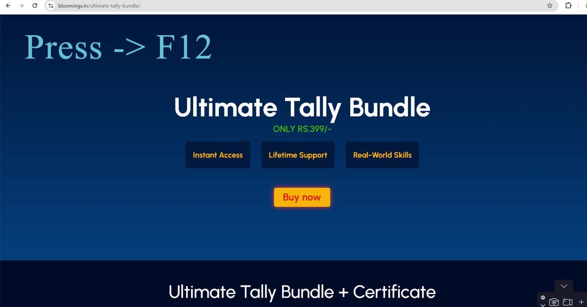
Step 1: Open Chrome DevTools
Open your site in Google Chrome.
Press F12 on your keyboard.
You will see a panel open on the right or bottom.
At the top left of this panel, click the phone/tablet icon. This is called Device Toolbar.

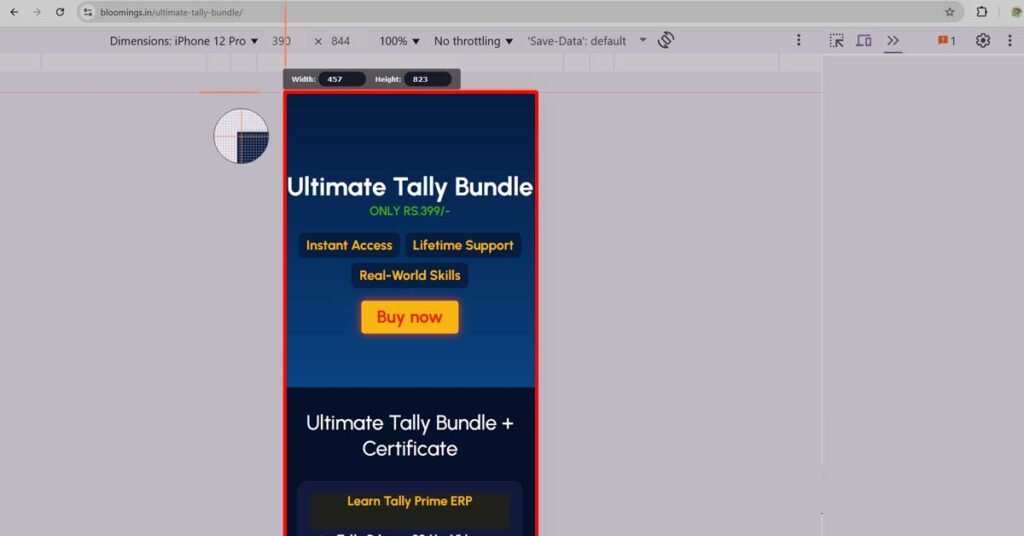
Step 2: Choose a Mobile Device
Now you can select a phone model. For example:
iPhone SE → 375 × 667
iPhone X → 375 × 812
iPhone 12 Pro → 390 × 844
iPhone XR → 414 × 896
Samsung Galaxy S20 Ultra → 412 × 915
If you don’t see the one you want, pick Responsive and type custom size. Always keep Zoom = 100%. This is how you record website in mobile view correctly.
Step 3: Set the Viewport Size
Sometimes when you set 100% zoom, the number may not match exactly (for example, 390 × 844 may show as 457 × 803). Don’t worry. This happens because of screen pixel ratio. The site is still correct. Just focus on the mobile box area.
Step 4: Record with Movavi
Open Movavi Screen Recorder.
Select Custom Area.
Drag the box around the mobile view in Chrome.
Keep Frame Rate = 30 fps.
Start recording.
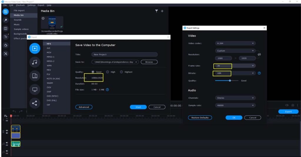
Step 5: Export Your Recording
When you finish recording, open the video in Movavi Video Editor.
Export settings:
Format: MP4
Resolution: 1080 × 1920 (Full HD, vertical)
Bitrate: 8–10 Mbps
Frame Rate: 30 fps
This way, your video looks perfect on YouTube Shorts, Instagram Reels, or TikTok.
Extra Tips to Record Website in Mobile View
Only record the viewport, not the grey background.
Test different devices (iPhone, Samsung, Pixel) before recording.
Upscale the video for sharper text if needed.
FAQ
Why should I record website in mobile view?
Recording a website in mobile view helps you see how it looks on smartphones. It is useful for client demos, tutorials, and social media content.
Which device size should I choose?
The most common mobile sizes are iPhone 12 Pro (390×844), iPhone XR (414×896), and Samsung Galaxy S20 Ultra (412×915). You can also use iPhone X (375×812) as a standard.
What is the best export size in Movavi?
Export in 1080×1920 pixels (Full HD portrait). This size works well on YouTube Shorts, Instagram Reels, and TikTok.
Why does Chrome show a different size when I zoom?
This happens because of device pixel ratio. Even if Chrome shows a slightly different size, the site is still rendered in the correct mobile view.
Can I record website in mobile view without Movavi?
Yes, you can use other tools like OBS Studio, Camtasia, or ScreenFlow. But Movavi is easy and beginner-friendly.
-
AboutBIT
You May Also Like
Sign up to receive our latest updates
Get in touch
Address
152A, Annavalaivu, Thuvakudimalai, Tiruchirappalli, Tamil Nadu – 620 022
Landmark : Near Post Office
Landmark : Near Post Office
bloomingtutorial@gmail.com